Maple Leafs leak new sweaters a day early
/Not much has changed apart from the striping and a hanger effect design.
Read MoreNot much has changed apart from the striping and a hanger effect design.
Read MoreThe new team's name and logo will be announced by October!
Read More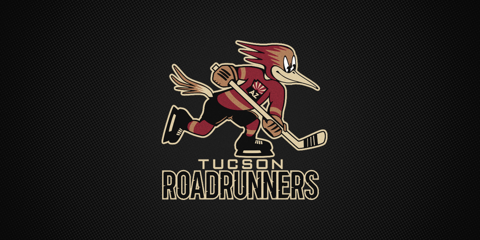
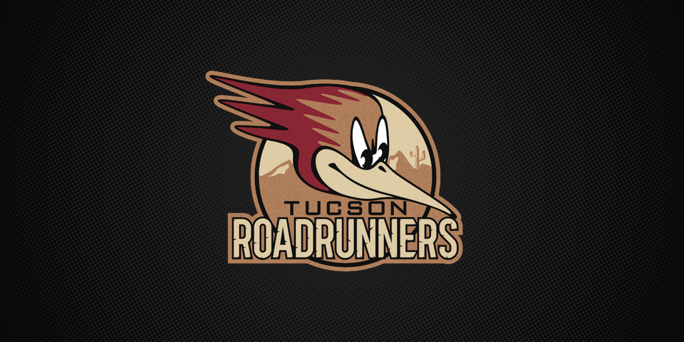
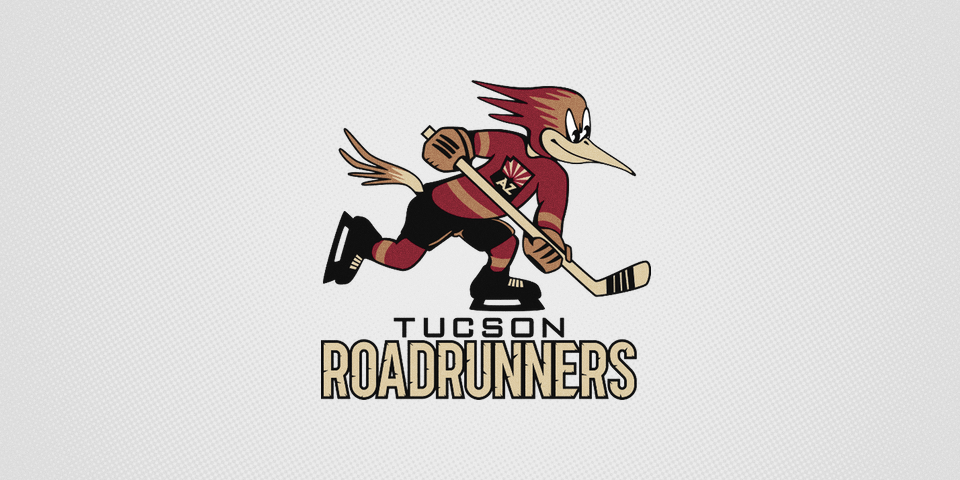
The Tucson Roadrunners will make their debut this fall in the American Hockey League. Their owner, the Arizona Coyotes, officially revealed the club's name and logo to fans this afternoon.
A long history of hockey in Arizona informed the naming of the new team, believe it or not. The original Phoenix Roadrunners first skated in the old Western Hockey League back in 1967.
The new logo is an revised take on that original design utilizing Coyotes colors with the addition of copper, symbolic of a common state nickname.
In fact, here's a look back at Roadrunners logos of the past to see how they compare to the newest one.
#Roadrunners pic.twitter.com/I7k6lU1cw5
— Yotes (@ArizonaCoyotes) June 18, 2016
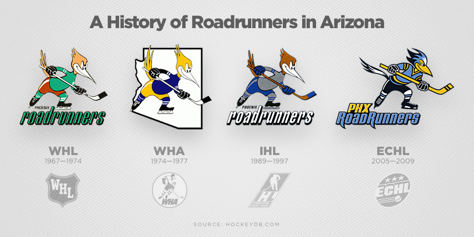
When the WHL went away in 1974, the Roadrunners transitioned to the World Hockey Association and later the Central and Pacific Hockey Leagues until 1979. The identity was resurrected in 1989 in the International Hockey League for almost a decade.
Most recently, the RoadRunners played a few seasons in the ECHL with a beautifully modernized version of the classic logo in WHA-era colors. I really like that one.
In Tucson, however, a lesser version of the original enters the timeline. The hand-drawn style looks lazy and amateurish. The press release credits the Coyotes' creative services department with the design — though I'm not sure they should want the credit.
I love the idea of bringing back the Roadrunners. And I'm all for taking cues from the original logos. But this is just a poor design. It's reminiscent of the type of thing you might see from a first-time artist on our Concepts page.
I hope something can be done to save it before October, but with merchandise already on the shelves in Tucson, I wouldn't bet much on it.
I've seen some negative commentary on the wordmark as well. It's actually a combination of the tired Bank Gothic font and the new custom type designed for the Coyotes' nameplates, which was introduced last year.
Overall, I'm torn on this one. I was excited about the name. I'm disappointed by the logo. Perhaps I'm being too harsh on a minor league team who had to scramble for an identity after being relocated from Springfield just two months ago, but I expected better.
What's your opinion on the Roadrunners?
The real story is in who created the team's new logos. Does the name Matt McElroy ring a bell? It should.
Read MoreAnd the creative force behind the new look is an Icethetics concept artist who's gone pro!
Read More