Coyotes show off 1996 throwback jersey set for March
/The Coyotes tweeted a rendering of the 1996 throwback jersey they'll be wearing in March.
Read MoreThe Coyotes tweeted a rendering of the 1996 throwback jersey they'll be wearing in March.
Read MoreLast Friday, the NHL finally made it official. These are the new jerseys we'll see later this month for the 2015 NHL All-Star Game in Columbus.
And that's not your screen. They really are that color.
If anything, hopefully the many months of speculation that these jerseys would feature some amount of neon green — dating back to July and all but confirmed last month — helped ease what would've otherwise been a pretty significant shock to the system.
Still. Wow. Seeing it there is just... inexplicable.
So I have to address that fact off the top. For the first time in league history, the NHL's All-Stars will wear neon green. Why? Allow me to argue with the press release.
The "elite green" color, while new to fans as a primary color, actually is in the necklines of all authentic NHL jerseys.
Oh lord, I'm sorry — "elite green." That's not pretentious at all.
"This was a fresher spin and a color that is unique," lead NHL Reebok designer Dominic Fillion said. "No other team owns this color so that was unique and it complemented very well the black and white while bringing a great accent with high visibility. We wanted something energetic and bright enough that it would stand out and grab your attention.
But... it's irrelevant to the NHL. You can grab someone's attention by stabbing them in the face but that doesn't mean you should do it. Guys, come on...
"We wanted something that fans hadn't seen on an NHL uniform before."
All right. Well, it makes it hard to take these people seriously when their strategy swings so wildly from one All-Star uniform set to the next.
Let me remind you that in 2011 — at the unveiling of the previous design in Raleigh — we were told that the six colors seen in the two jerseys were chosen because they represent the majority of teams in the NHL.
Now, they've chosen elite green — I'm sorry I just can't — neon green... because it represents no team? Really? And why is that a good thing? I'm at a loss.
At this point, the "chill out bro" comments are likely to start piling up, so let me say this for the record — I don't really care that the jerseys look silly. As a marketing professional, I'm a little bewildered at the league's lack of consistency and sense of taste here.
Stop pandering to dumb 12-year-olds! There are plenty of people with working eyes who would buy a nice-looking hockey jersey just because it looks nice.
Anyway, so there's more.
Another addition to the jersey is the authentic team logo and event mark on the shoulders, which is new with regard to the All-Star Game. Typical All-Star jerseys had the team logo for a particular player on the shoulder and in its actual team color.
"With this jersey we wanted to be consistent from head to toe, so we brought the team mark on the shoulder down to a more darker tone so it would complement the uniform look yet give it a modern visual," Fillion said. "We feel it complements the colors of the jersey well."
That's right, so just like the two-tone black and grey All-Star Game patch on the right shoulder, the player's team logo will be on the other should in the same colorless, two-tone style.
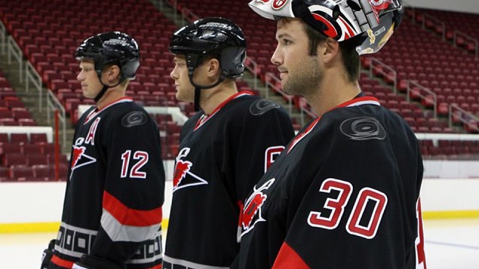
The good news, if you can paint it, is that Justin Faulk is already covered with the shoulder patch from his Hurricanes third jersey.
If you're curious about what the other 29 team logos will look like in black and grey, standby. I hope to add a complete graphic to this post soon.
The official unveiling of the 2015 @NHL All Star jerseys here at the @NHL Store in NYC. pic.twitter.com/BNuzeXboAS
— Steve Mears (@MearsyNHL) January 9, 2015

So that about does it. It should be clear by this point that I am not a fan of these jerseys. Normally, I like when the league steps outside the box for a new specialty jersey design, but this one just went three steps too far.
The All-Star Game has been a joke for quite long time now, but that doesn't mean the jerseys have to be as well. I know this one is likely to be recycled in 2016, but let's see something classy for the league's 100th birthday in 2017, right?
By the way, for those wondering about my extended absence recently, a quick explanation may be in order. I went to Florida to see my family for the holidays (first time since moving to Seattle) and followed that up with another trip for my wedding anniversary this past weekend — which ended with me getting extremely sick. Food poisoning, I imagine. I'm over it now, but it was touch and go for a while.
All that conspired to keep me away from the site these last three weeks. But I'm back now and I'll be covering all the bits of news I missed in that span. And there were some good nuggets. So stay tuned to the blog for more throughout the weekend.
As promised, here's a projected look at the 30 NHL team logos as they will appear on the shoulder of each player's 2015 All-Star jersey.

Photos from Team LA Store and @LeeZeidman
Images from Team LA Store
Photo from FOX Sports West
Images from Team LA Store
Photo from FOX Sports West
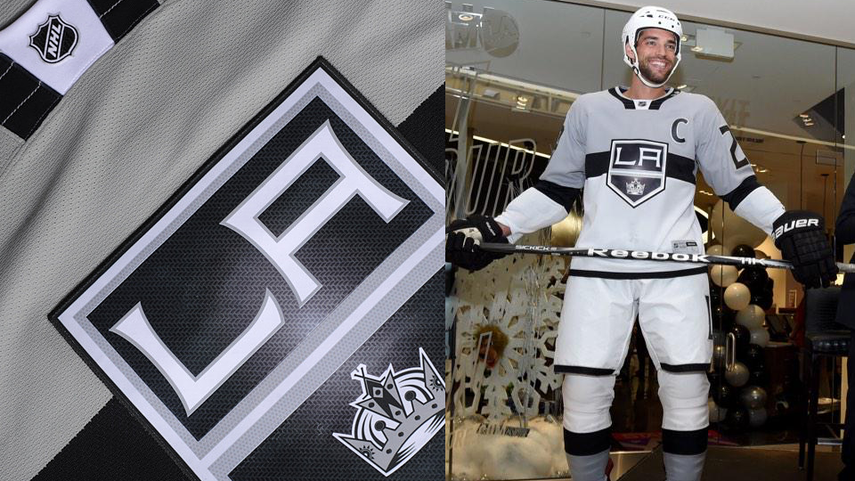
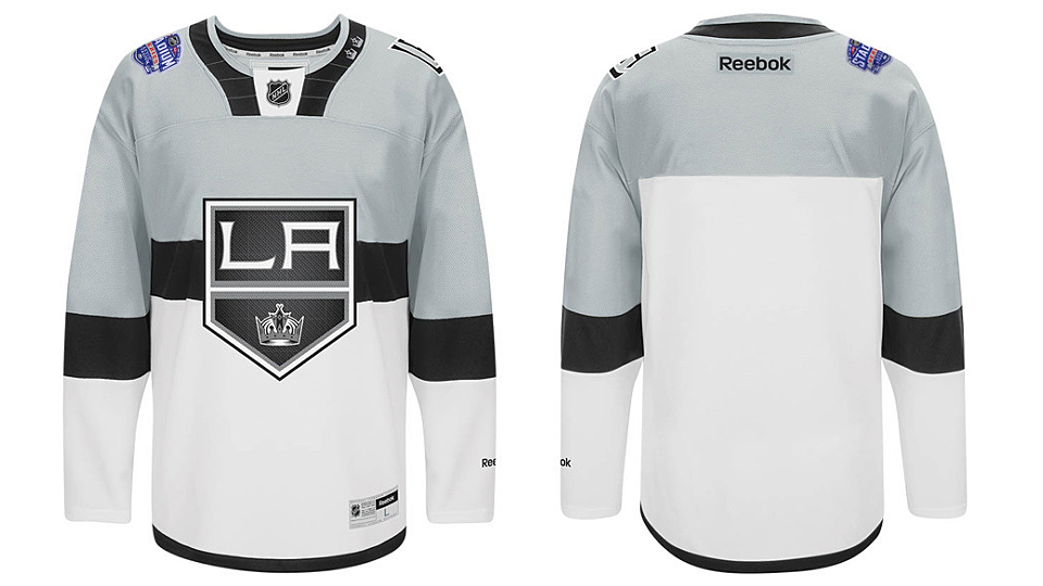
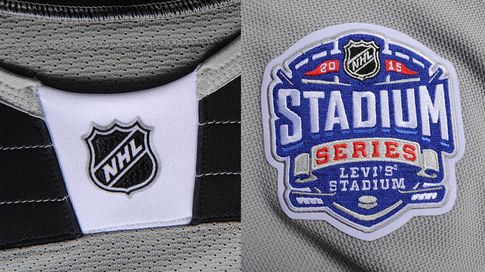
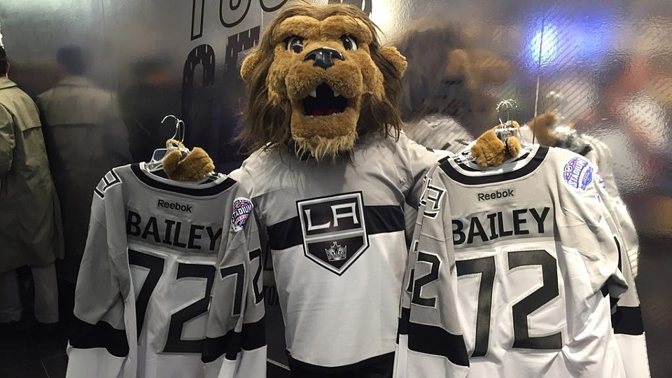
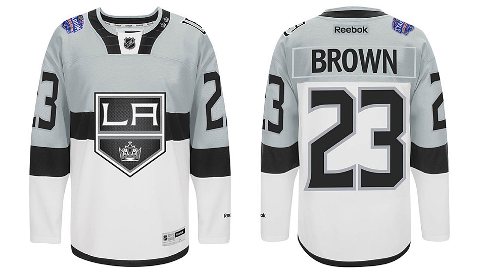
After four decades on the scrap heap, white hockey pants are staging a comeback in SoCal!
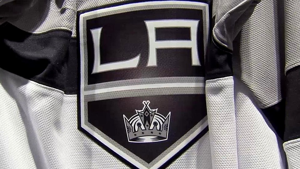
Tonight, the Los Angeles Kings revealed their new 2015 NHL Stadium Series uniform to the world at the opening of the new Team LA Store at Staples Center.
While the team was in St. Louis losing to the Blues, club president Luc Robitaille unveiled the jersey back home — proving the rumors true.
Weirdly, the most remarkable element of the uniform is not the sweater, but rather those white pants. That travesty hasn't seen action on NHL ice since the Washington Capitals fixed their mistake during their inaugural season in 1974.
At the unveiling, Robitaille was quick to point out that the players OK'd the white pants. Well, now they actually have to wear them.
As much as I'm giving the Kings a hard time, I actually really like the look for a single use. That last part is critical. I wouldn't want to see any team try it full time, but for a special event, what the heck. Go nuts.
Another neat aspect of the uniform pointed out by Robitaille are the two crowns on the left side of the collar. They represent the Kings' Stanley Cup championships in 2012 and 2014.
Now let's take a step back and look at the bigger picture. As with last year's Stadium Series, the teams involved are using the same jersey template — but with their own colors.
For better or worse, the game gets a cohesive look.
After the unveiling of the Sharks' jersey last week, I said my peace about the collar. I don't like it. I'm also not sure I'm a fan of the giant sleeve numbers.
It's jarring at first glance. Hockey jerseys aren't supposed to look like that. Or so tradition would tell us. It could grow on me in time, but for now I feel like any potential usefulness it creates for a 70,000-seat stadium is outweighed by the aesthetic atrocity that's being committed.
Time will tell, I suppose.
So there are our 2015 NHL Stadium Series jerseys. What do you think?
All photos from San Jose Sharks
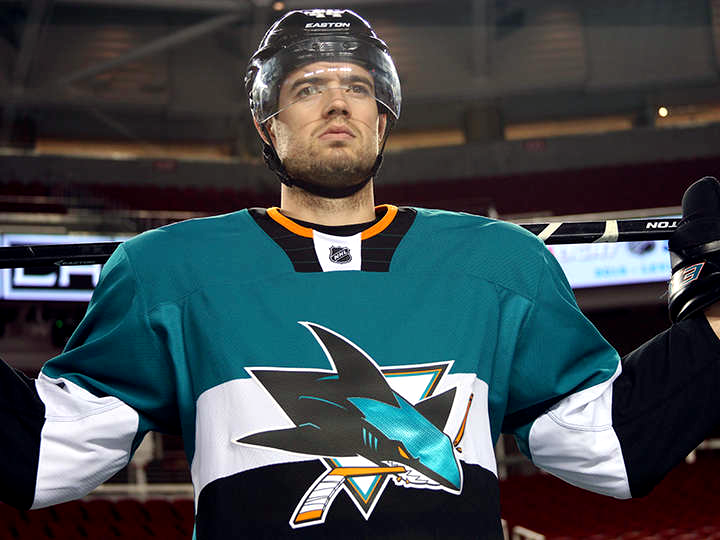
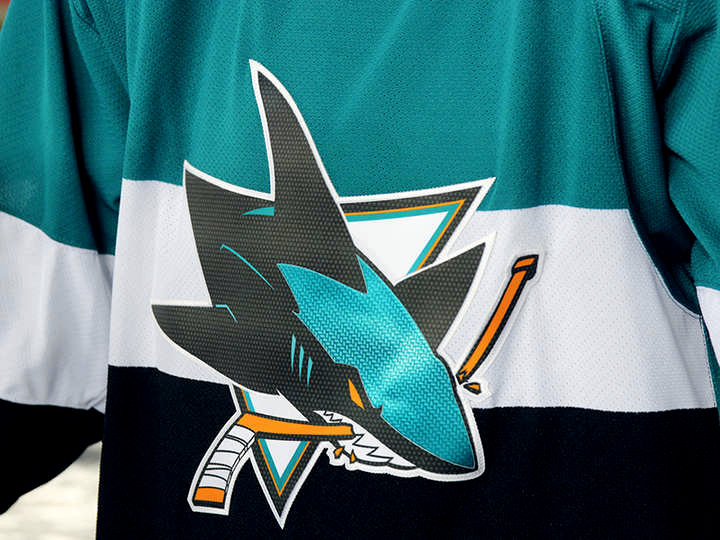
One week after we got a sneak peek at the 2015 NHL Stadium Series uniforms, the San Jose Sharks have made their new jersey official!
The new look was unveiled on the Sharks' website this morning. It showcases a handful of new features for a Reebok Edge jersey — including a flat collar design, "carbon fiber" crest, and giant sleeve numbers.
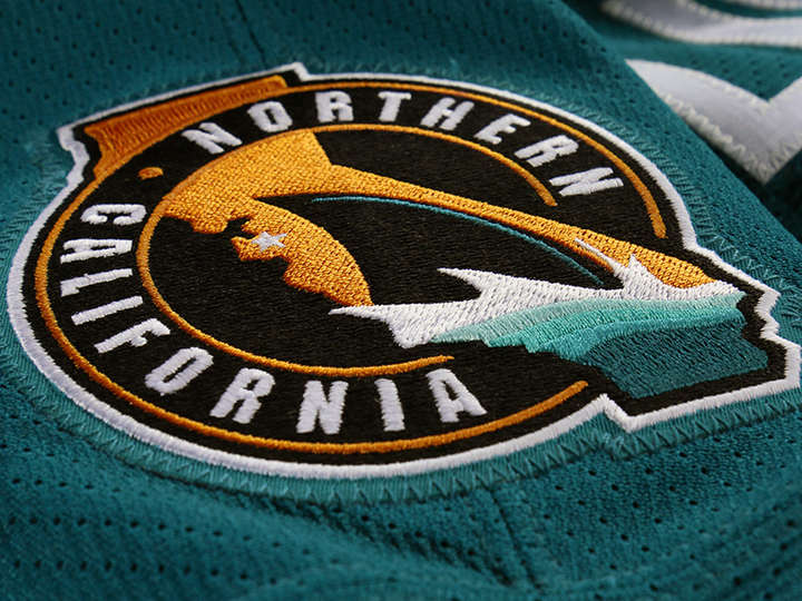
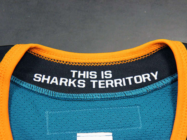
A new "Northern California" shoulder patch has been introduced to the Sharks' branding lexicon and a new hanger effect treatment in the collar uses the team's marketing slogan, "This Is Sharks Territory."
But the most attention-grabbing element of the design is the half-and-half color scheme, teal on top, black on bottom and a white stripe across the middle — not unlike the classic Canadiens' jersey feature.
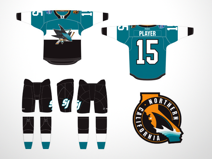
A look at the full uniform in this rendering from the team shows a simplified version of the "SJ" ligature on the left leg of the pants.
We can also see the white and black areas on the front of the sweater do not continue around to the back. This is to make sure the numbers are easier to read from long distance.
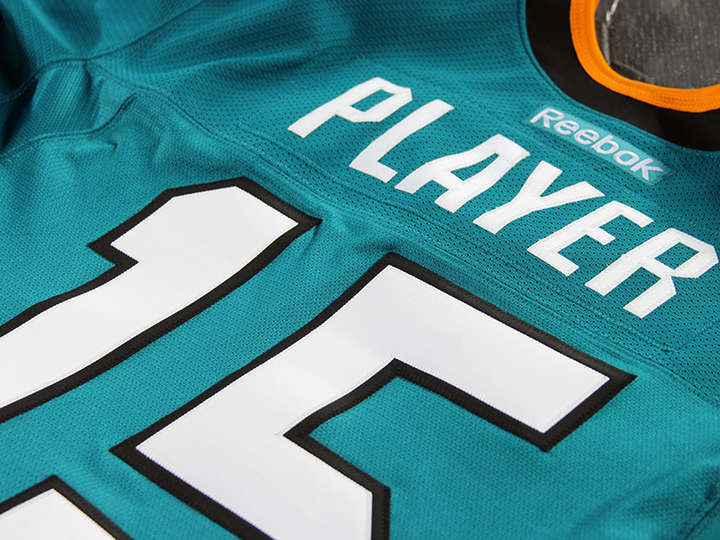
In fact, the Sharks' press release explains in detail many of the new features of this uniform. Reebok designers worked under the motto, “If you can’t see it from 200 yards away, does it need to be there?” — hence the oversized numbers.
The numbers on the back were increased from 11.5 to 13 inches in height while the sleeve numbers jumped from 4 to 7 inches. Fans seated far from the ice at Levi's Stadium will surely notice and appreciate the difference.
Also from the release:
The collar construction was designed to be to be more streamlined and robust, integrating it into the construction of the jersey more seamlessly. It now lays flatter, and cleaner against the shoulders and neck area.
The problem I have with this is its similarity to Nike's hockey jerseys. Personally I like to see some definition in the collar. This flat collar just looks incomplete.
The crest, although not enlarged, has been executed in lighter weight materials and features a carbon fiber finish for greater visual impact.
Basically, Reebok heard the backlash against the awful-looking Photoshop-enhanced flat, printed chrome crests and decided they should do it all over again — only worse.
Honestly, are the embroidered logo crests really doing that much to impede the greatest athletes on the planet? As long as it's just for a single game, I'm fine with it. But I'm worried about the trend.
Appearing on the shoulder is a new mark that was created to pay tribute to the Sharks' devoted fans in Northern California. The mark incorporates the state of California, with a star on San Jose, marking the exact home of the team. Placed at the bottom of the mark is the iconic dorsal shark fin, which has been borrowed from the SJ ligature the team currently uses.
This logo is a great way for the team to lay claim to a larger geographical region and I'm sure we'll see more of it in the years to come. It's a solid design and makes more use of the orange in the Sharks' palette — though I know many Sharks fans would rather it disappeared entirely.
By the way, we now know Marc-Edouard Vlasic was the guy posing in the photo I shared last week.
The Kings are scheduled to unveil their Stadium Series jersey on Tuesday. Expecting the same basic template with Kings colors and logos.
Overall, I'd call this an acceptable jersey for one-time use. What about you?
Photo from San Jose Sharks
Photo by Graeme Logie
On Friday we got our first look at renderings of the jerseys slated for the 2015 NHL Stadium Series game taking place in California on Feb. 21.
Today, I'm now able to share with you the photo on which the San Jose Sharks rendering was based.
This shot was taken by Graeme Logie on Nov. 21 at Levi's Stadium — the site of the outdoor game. He's generously provided the image to Icethetics to give us a sneak peek at what's coming.
It depicts what seems to be a photo shoot with a player wearing the new jersey out on the field.
The lack of detail is a result of the photo being taken from a long distance by a basic point-and-shoot digital camera. It has been cropped and resized.
However, you can make out a couple of details not seen in Friday's artist rendering. For example, the collar does appear to have a bit of orange.
Logie also provided us with this photo of the scoreboard at Levi's Stadium from the same day.
Photo by Graeme Logie
So now that you've seen an actual photo of the jersey, has your opinion of it changed?
FURTHER READING: First look at the 2015 NHL Stadium Series jerseys