Is the NHL planning black and neon green All-Star jerseys?

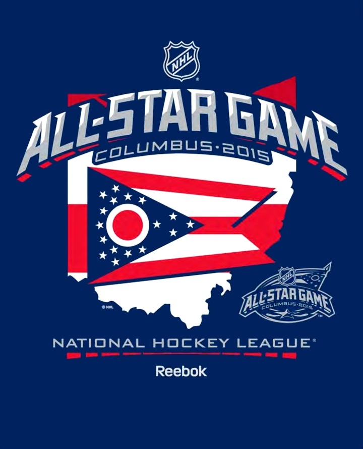
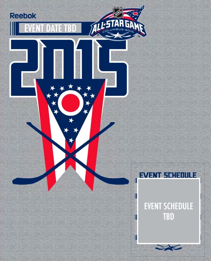
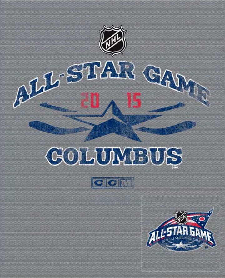
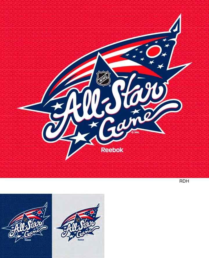
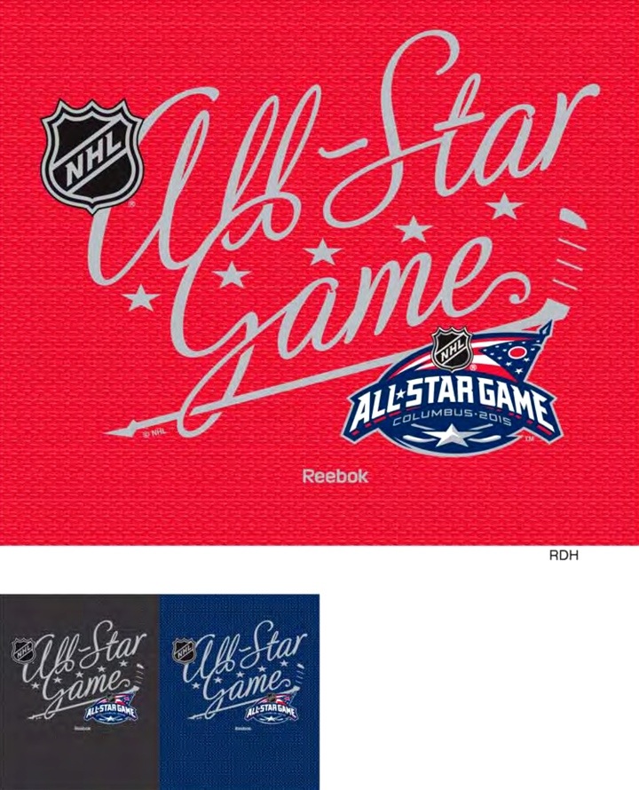
Reebok's NHL Spring 2015 apparel catalog has leaked online and it provides some fascinating insights into the aesthetics of the upcoming 2015 NHL All-Star Game.

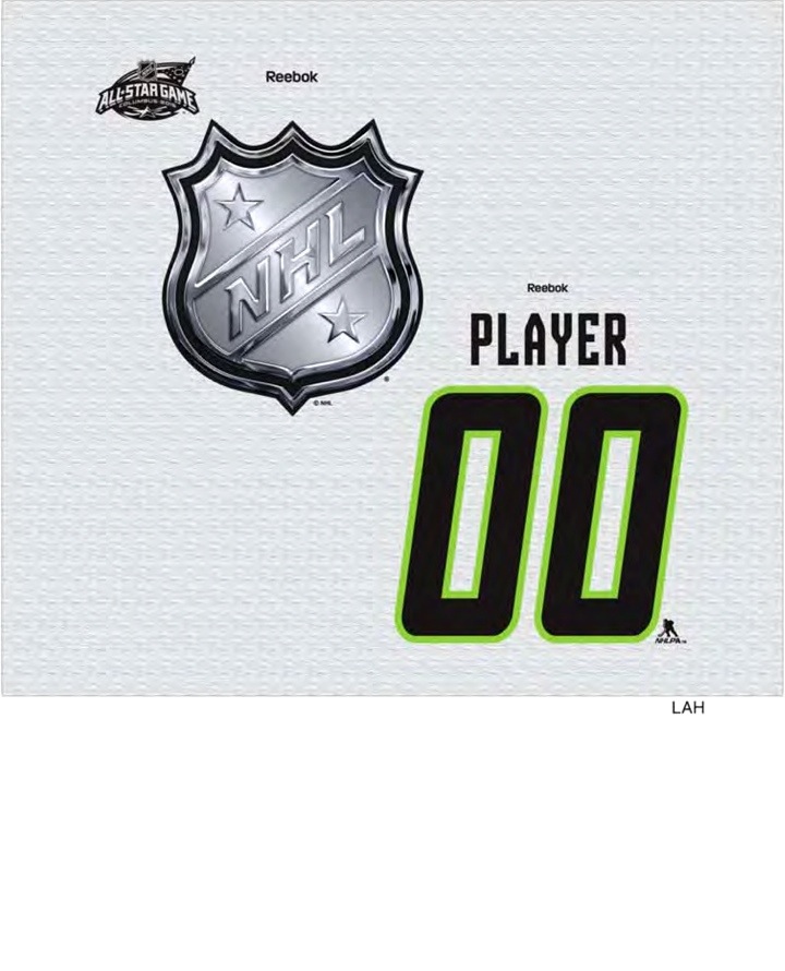
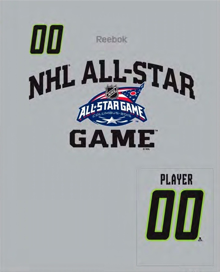
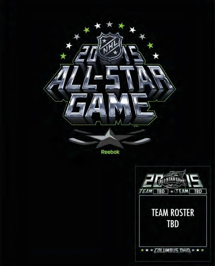
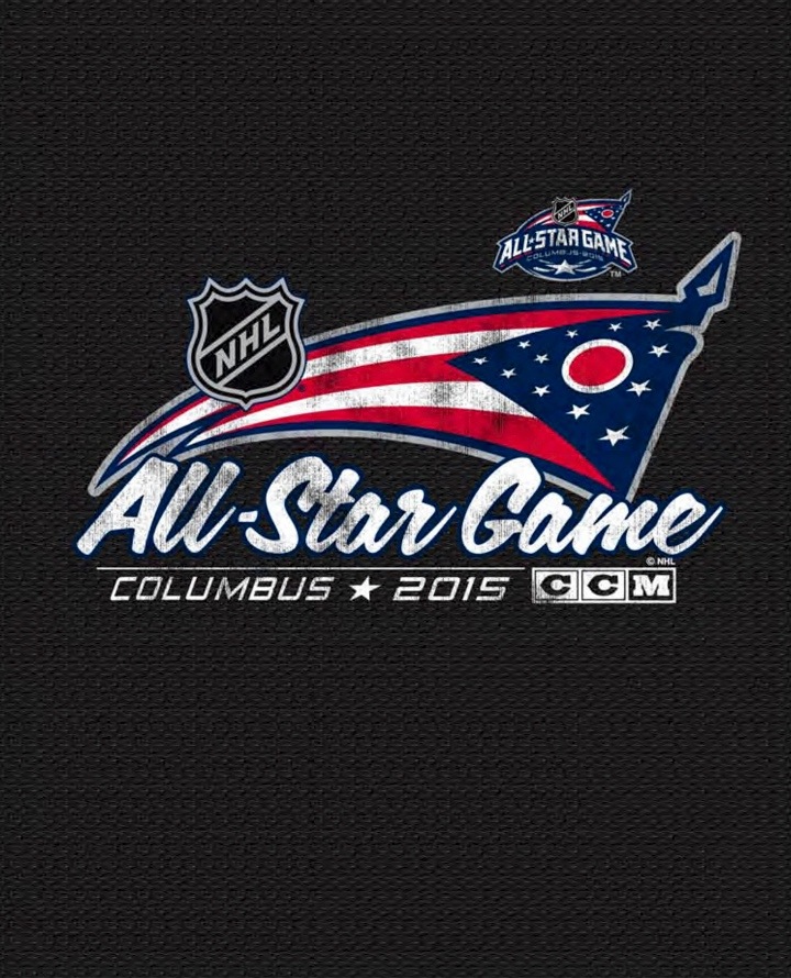
The catalog shows black and neon green heavily featured on the T-shirt designs from a line styled after jerseys. All of the following images are pulled from that catalog.

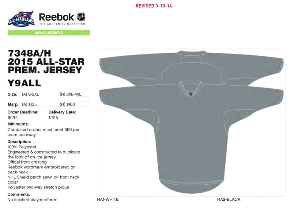
We begin on page 94 where the Premier replica All-Star jerseys are noted. Unfortunately, the designs were not included when this catalog was last updated on May 29 — the date seen on the cover. So what can we glean from this page?

  • Delivery date is listed as Jan. 1, 2015 — the date of of the Winter Classic in Washington, D.C. Could the jerseys be unveiled at the NHL's signature New Year's Day event?
  • The codes "HA1-WHITE" and "HA2-BLACK" appear below the graphic. Might they suggest the colors of the two jerseys? The last time the NHL had a black versus white All-Star Game was 1993 — back when they used the old NHL shield and orange trim.
  • Speaking of trim, check out the bar at the top that reads "Men's Jerseys." Will neon green return to NHL ice for the first time since the Blue Jackets dropped it in 2007? Don't forget, this All-Star Game will be played in Columbus. Coincidence?

All I know is the appearance of neon green — or electric green as the Jackets referred to it — made several more appearances in the catalog.

If we skip down a few pages, we find that electric green used in several T-shirt designs.

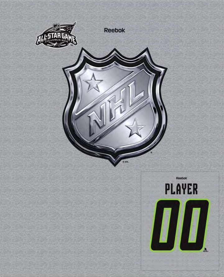
Not only is there a green shirt in the batch, but the player numbers — which would be printed on the back — are black outlined in green.

It's hard not to see this as being pulled straight from the jerseys.

Also noteworthy is the new treatment for the All-Star version of the NHL shield. If it seems familiar, you're probably thinking about the chrome logos introduced last year for the teams that participated in the 2014 NHL Stadium Series.
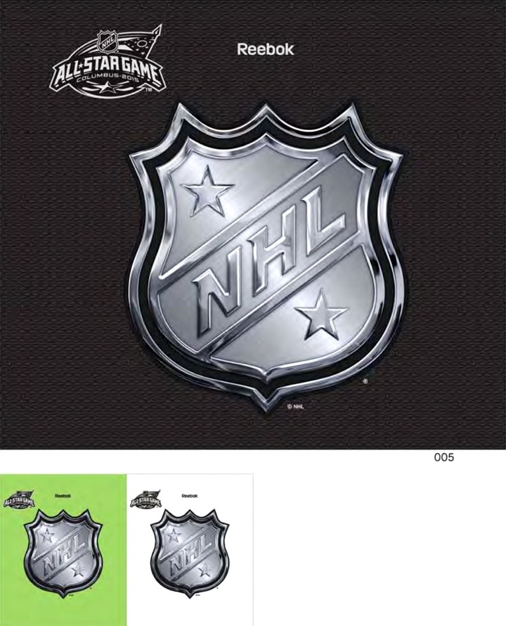
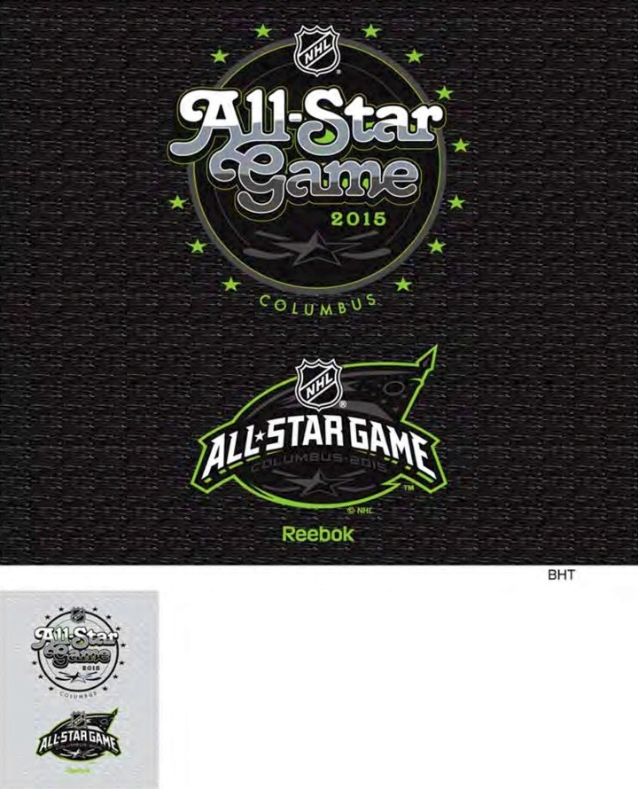
But, wait there's more. More neon green, of course. 

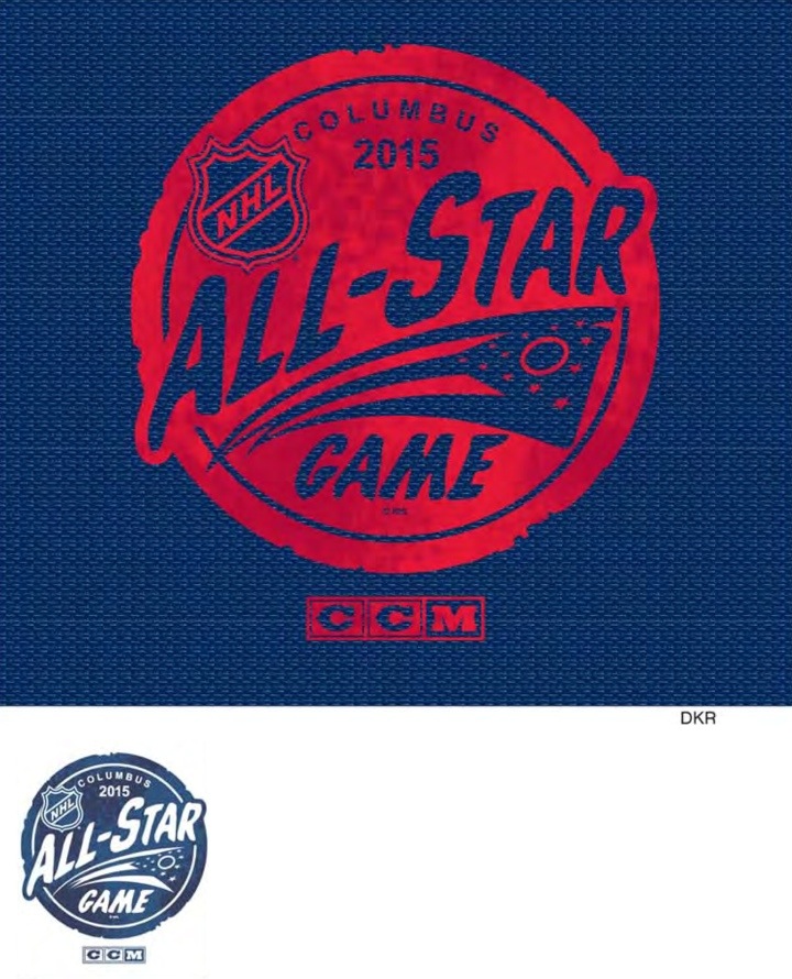
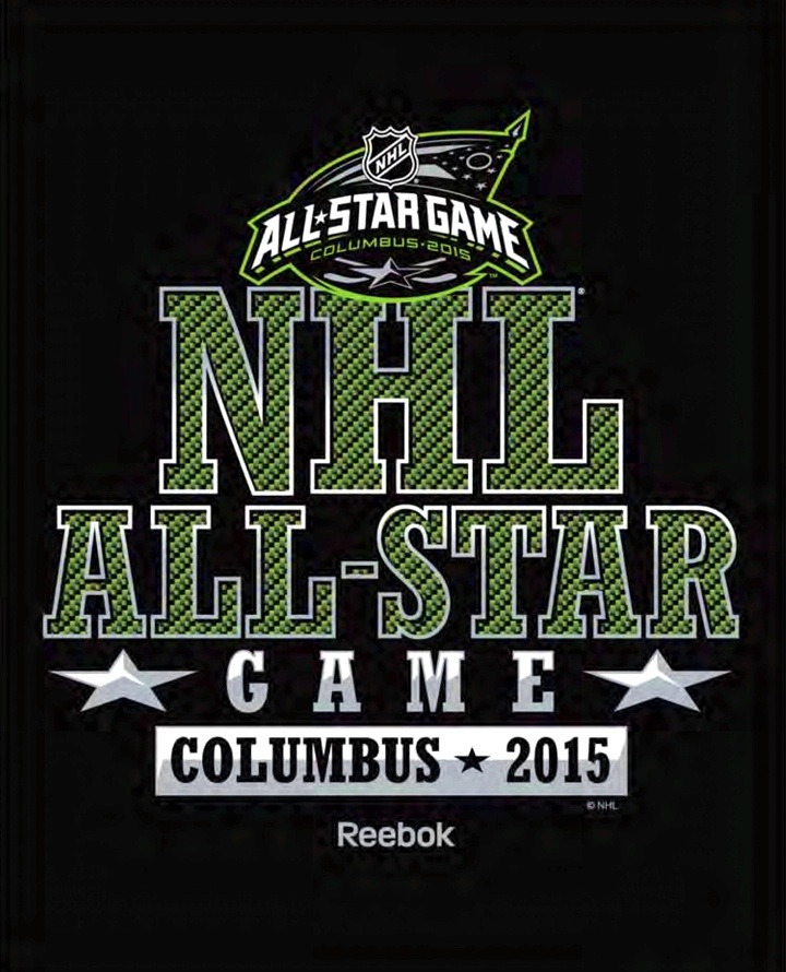
Several other T-shirts include various alternate treatments for the logo — particularly in black, grey and green.

If you're still not sold on the idea that neon green is likely to be part of the NHL All-Star Game jerseys — you're probably part of a dwindling group.

Unless there's another reason for it that I'm failing to see.
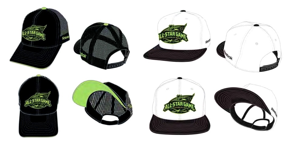
Beyond the shirts are some headwear selections, including these hats.

0716-rbk15-124.jpg

If you're not interested in downloading the catalog yourself — or it's no longer available when you're reading this, I've grabbed some more T-shirt designs that use a ton of variations on the All-Star Game logo. You'll definitely have your pick if you end up buying one.

If you're looking at some of these treatments and thinking they look rather girly, it's probably because they're women's designs.

Anyway, there are definitely a lot of options here — male or female.

Have a favorite design? Let us know in the comments.
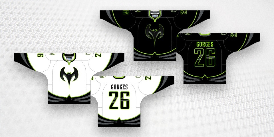
Lastly, I can't end this post without at least mentioning the IceHL — Icethetics' own fantasy hockey league. We have a team whose colors may seem quite familiar. 
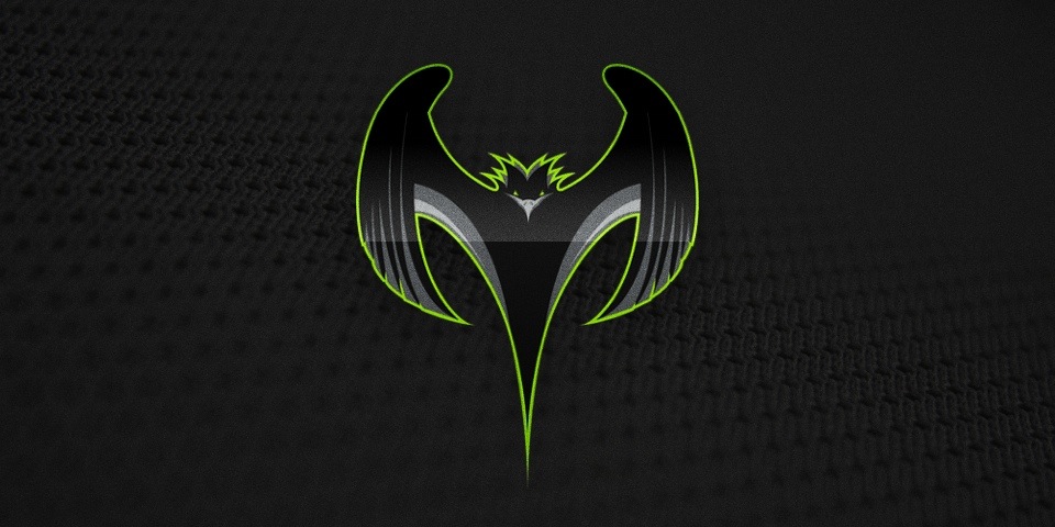
To those who have wanted to see a North Carolina Nighthawks jersey produced, stay tuned. The new NHL All-Star uniforms may be right up your alley.

Rumor no more: Flyers confirm new third jersey

On Tuesday night, the Philadelphia Flyers confirmed they have a new third jersey in the works for the upcoming 2014-15 season.

The news came by way of team COO Shawn Tilger during the Flyers Town Hall Meeting — a special event for season ticket holders.

That's literally all we learned. A new alternate is on the way. The bigger question is, what will it look like? For that, we'll have to wait.

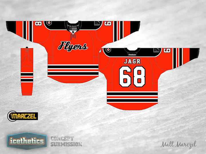
But there's nothing like the confirmation of a new jersey's existence to get our talented concept artists to gear up. We should see some interesting stuff.

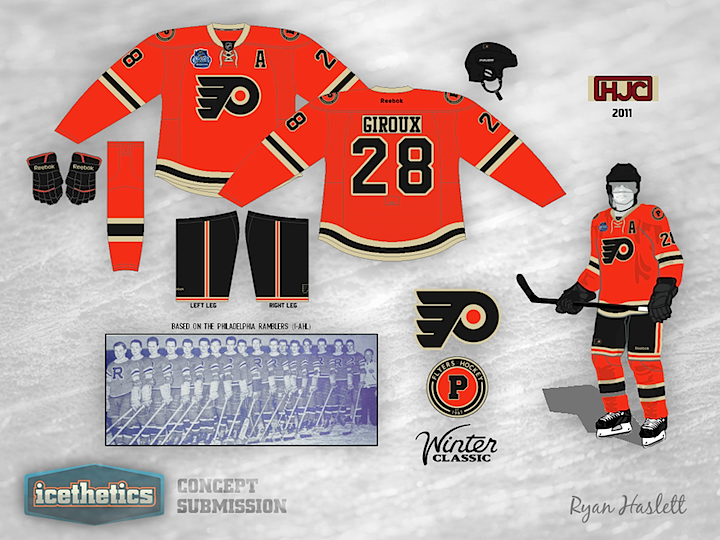
Meanwhile, the rest of us will have fun ignorantly speculating. I'll get us started. The most obvious possibility is to simply resurrect the last non-primary jersey the team wore — the one from the 2012 NHL Winter Classic. Those were nice.

Flyers 2012 Winter Classic jersey

A lot of teams look to their past for third jersey ideas, often bringing about classy throwbacks. In Philly's case, they're already wearing the same sweaters they had through their first 15 years of existence.

So what about more recent designs? Here are some other orange jerseys the Flyers have worn.

If you grew up in the 1980s and '90s, the one on Eric Lindros is forever embedded in your memory as the epitome of Flyers sweaters. Meanwhile, Peter Forsberg is wearing a short-lived third jersey, worn from 2002 to 2007. It features the reviled 3D revision to the classic Flyers crest.

How about black jerseys?

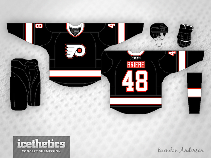
They've never looked good in black, but that hasn't stopped them from trying. Forsberg's jersey launched as a third in 1997 and was promoted to full time use in 2001 until 2007 when Simon Gagne's jersey took over. That one was retired in 2010.

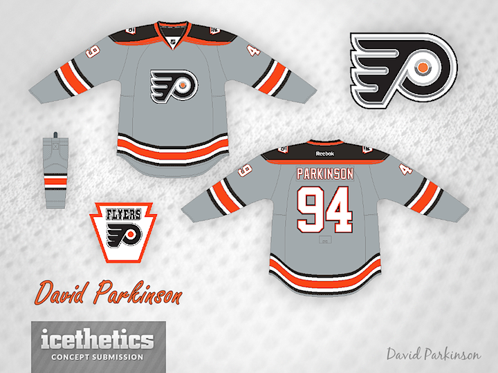
I've heard rumblings that team management is amenable to incorporating Philadelphia's Liberty Bell into its uniform symbolism. Maybe now is the time?

What do you think the Flyers should do?

Flyers home/road jerseys, 2010—

RELATED CONCEPTS

Classic look coming to St. Louis Blues this fall

THE SNEAK PEEK

When the St. Louis Blues take the ice for their season opener on Oct. 9 against the Rangers, they will be wearing this sweater for the first time.

Recently, I got a sneak peek at the new home jersey the Blues will start using in the fall. And while I don't have any photos to share with you, I was able to recreate what I saw in the graphic above.

Here's a quick rundown:

  • Colors and crest not changing.
  • Big, bold striping dominates design.
  • Yellow piping gone; waist stripes return.
  • Shoulders inspired by original 1967 jersey.
  • Hanger effect design: "EST. 1967"

Basically, the overall design looks a lot like it did before the Blues had their jerseys overhauled by Reebok in 2007. (Photos on the right.)

The new look continues a trend of teams adopting more traditional jersey designs in the years since Reebok's league-wide modernization.

While the home and road jerseys will be replaced in 2014-15, the third jersey will stick around.

Unfortunately, the Blues have yet to announce an unveiling date for the new sweaters at this point. Hopefully we hear something soon.

Since I only saw the home jersey, the road design is still a bit of a mystery. That could be fun for our talented concept artists.

Email me your interpretation of a new Blues road jersey to go with this one and I'll post some on the Concepts page this week.

St. Louis Blues jerseys, 2007—2014

St. Louis Blues jersey, 1998—2007

Hockey Canada celebrates a century of jerseys

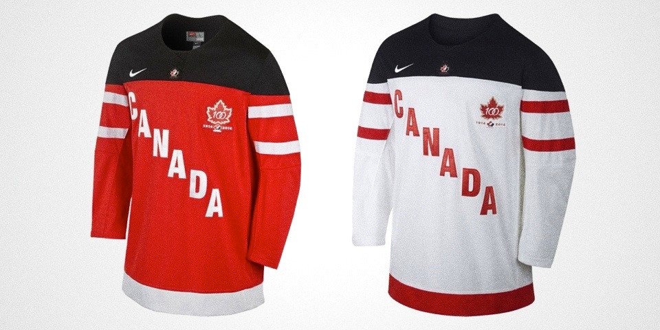
Hockey Canada introduced special new sweaters on June 26 to commemorate their 100th anniversary.

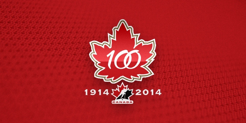
The red and white Nike-designed jerseys are simple enough with black shoulders and CANADA emblazoned diagonally down the chest. They also feature the new 100th anniversary logo.

Hockey Canada and one of its premier marketing partners, Nike, revealed a special 100th anniversary jersey that will be proudly worn by Canada’s men’s, women’s and sledge hockey teams throughout the 2014-15 season.
“The new Hockey Canada jersey is an emblem of Canada’s deep hockey history and passion for the game,” said Scott Smith, chief operating officer with Hockey Canada. “The 100th anniversary of Hockey Canada is a unique moment in Canadian hockey history, and we are proud of the design and innovation in the jersey Nike has provided to Hockey Canada to celebrate the occasion and Canada’s national teams.” 

If you want to buy one, click here.

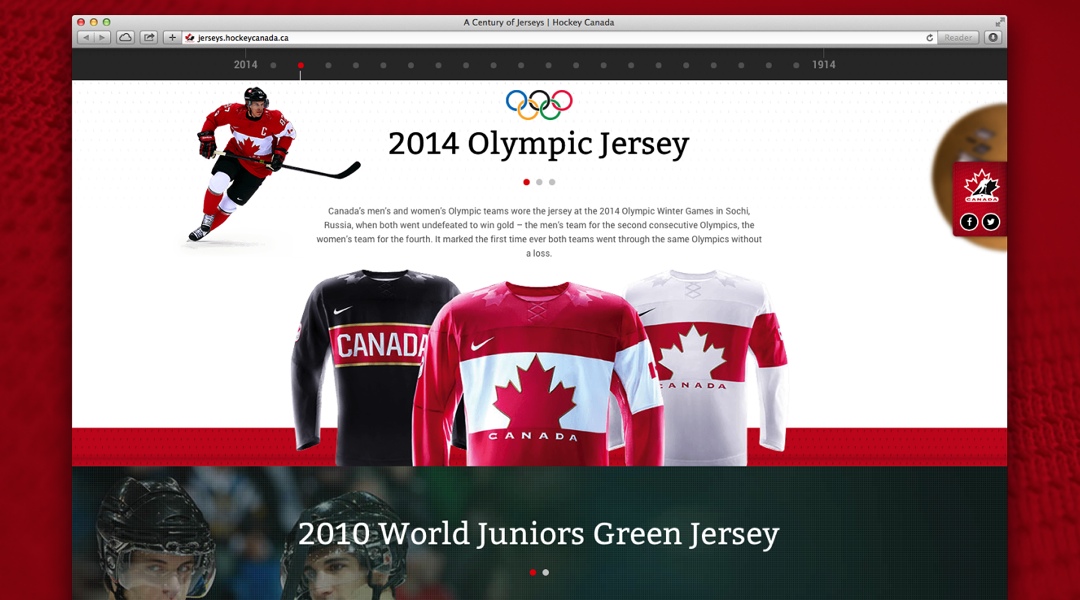
The organization also published a microsite called A Century of Jerseys that beautifully recounts the various sweaters worn by the Team Canada throughout its first century.

Seriously, it's an incredible site. It's packed with information, photos and the interactive design is brilliant. But before you click, make sure you have some time to spare. You'll need it.

When you get done, drop back by and tell us which Team Canada jersey is your favorite.

jerseys.hockeycanada.ca

jerseys.hockeycanada.ca

Indy Fuel get up to speed with ECHL expansion

START YOUR ENGINES

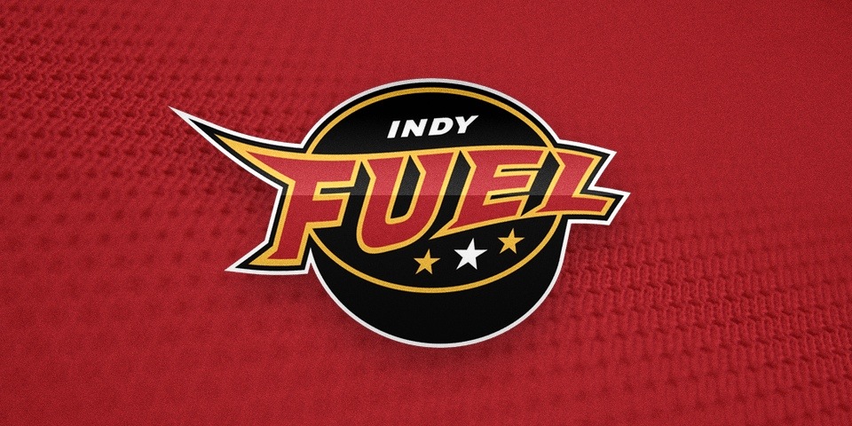
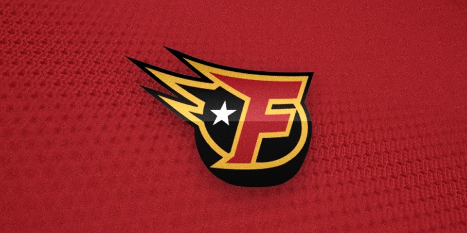
The ECHL expands to 22 teams in 2014-15 with the addition of the Indy Fuel. The announcement of the new franchise and the unveiling of its logo came back in November. (Apologies for the extended delay!)

The club's logo was designed by Indianapolis-based ad agency CVR. Despite the professional credentials, it looks a bit like the work of an amateur. Can't help but wonder if CVR gave the project to an intern.

No one wants to look at it. // Photo from Indy Star

No one wants to look at it. // Photo from Indy Star

What an odd place the ECHL is when it comes to logos. So hit and miss. In the same year that brought the epic Orlando Solar Bears logo came that of the now-defunct San Francisco Bulls. Go figure.

Via Twitter, the team promised a jersey unveiling in "the next few months" — remember that was in November — but I still haven't seen anything. Hopefully they'll have it sorted out soon.

The Fuel will play at the Pepsi Coliseum in Indianapolis. They are now one of three teams based in the state of Indiana, joining the Fort Wayne Komets and Evansville IceMen.

Currently, the Fuel are running a contest to have fans create the team mascot.

CONNECT

Find the Indy Fuel online: