Lethbridge Forced to Change Logo

Starting next season, the WHL's Lethbridge Hurricanes will have a new logo and uniforms. The change comes after the Washington Capitals told the junior club their current logo and uniforms were a bit to similar to the NHL club's.
CTV reporter Darrell Romuld tweeted this last week:
President: The Lethbridge Hurricanes have been handed a timeline to change their uniforms by the Washington Capitals; Complained likeness.
— Darrell Romuld (CTV) (@CTVDarrell) March 21, 2013
He followed up by pointing out that the logo currently used on the Canes' third jersey would be promoted to "full time" use next season. It's the logo you saw at the top of this post. The real story is in how this new logo came to be and its designer's connection to Icethetics.
But first, we should compare the offending logo with that of the Capitals.

The Hurricanes made this their primary logo in 2011. At first, it looked like a bad mix between two Southeast Division NHL teams. But after two seasons, the Caps have had enough.

We all know what their logo looks like. The similarities are obvious but, to be honest, the Lethbridge logo is just a poorly-designed rip-off. No one should be disappointed to see it go.
The new one, however, is a breath of fresh air. It was designed by Joshua Schroeder, who was named GM of IceHL's Calgary Cavalry in the fantasy league's inaugural season in 2010. He departed last summer. But his connection to the Hurricanes is what's interesting here.
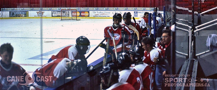 Photo courtesy Joshua Schroeder
Josh writes:
I've got a bit of a history with the Hurricanes, starting in 1999 when I was invited to training their training camp. That's me sitting on the boards in the middle. As you can see, we were wearing an old set of the team's jerseys. I was on my way home by the time the veterans reported to camp.
The Hurricanes' actual logo at the time was the infamous Tasmanian devil, or "Twister" logo, since that's the name of our Tasmanian devil mascot. (Yeah... twister, hurricane... apparently we're pretty confused about weather around here.)
Fair enough. Speaking of which — here's that "infamous" logo.

Josh tells me he moved to Lethbridge a few years later to attend college. He stuck around, became a season ticket holder, then founded CanesCast, the official social media partner of the Hurricanes. He bemoaned the bad logos the team endured over the years. And in 2010, he got inspired.
In March 2011, the Hurricanes launched a design contest for the team's 2012-13 alternate jersey — which was more than a year away at the time. So he started putting together a concept.
 Artwork and photo courtesy Joshua Schroeder
Josh explains:
I also put together a full proposal package explaining the symbolism that was worked into the design and sent that off to the Hurricanes.
Right around the time I learned that my design had been selected, the new Winnipeg Jets logo was leaked. Another hockey team logo with an aircraft in an RCAF emblem-inspired design. I was a little discouraged at that point, since I figured that by the time my jersey was unveiled it would look like I had just copied the Jets (who, remember, were still the Thrashers when I created my logo).
I got over it, and I still like that I managed to work the symbolism into my logo a little more subtly than the Jets did.
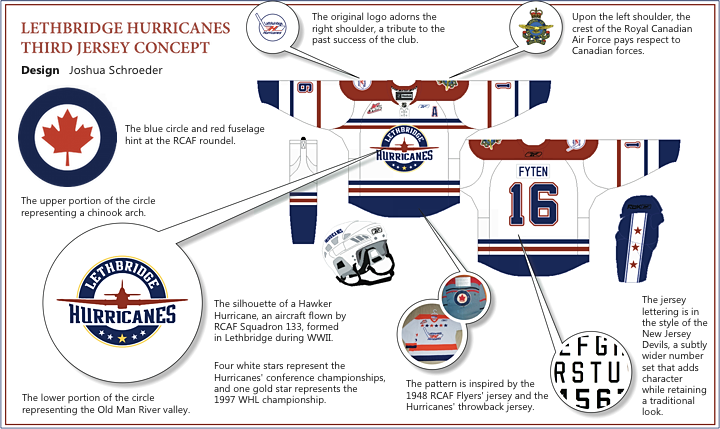 Artwork courtesy Joshua Schroeder
As you can see, Josh put a lot of thought and research into this design. Never has one team worn so much meaning and history on their uniforms. Great to see it will be getting full time use starting next fall.
 Photo courtesy Joshua SchroederMore from Josh:
Anyhow, that's pretty much where my involvement ended. I'd been told I'd won, but couldn't make it public knowledge.
The next summer I got a sneak peek at the jersey, and again had to keep it a secret. Unfortunately, the final design the team went with abandoned the striping pattern from my concept, which again was a bit disappointing, but it still looked good.
Early in the 2012-13 season the logo was leaked on our veteran goalie's new mask, and finally (FINALLY!) we got to unveil it in November.
I was able to talk about it and enjoy doing the media rounds for a couple of days. And of course, as winner of the contest, I got my own customized jersey, presented to me at centre ice by captain Graham Hood (photo above).
Sounds like any hockey concept artist's dream!
Josh said a handful of the jerseys were made available in the team store and — despite a higher price — sold out in two nights.
I'd heard a rumour earlier this season about the current Capitals-style jerseys needing to be replaced.
While it sounds like they haven't made a decision on what to wear next year, the indications point toward them adopting the Hawker Hurricane logo full time. The third jerseys were in heavy rotation by the end of the season.
And check out the carpet in the locker room (even Curtis Joseph thinks it's awesome!).
CTV Lethbridge has speculated that the team will add a blue version of the jersey and promote the third jerseys to full time use. As you can imagine, that would suit me just fine. I do work pretty closely with some of the Hurricanes' front office staff on game days now, so they know where to find me if they wanted to get me involved with the design process again.
To this point, though, I haven't been invited to be part of the process.
I know that's a lot of information to digest, but if you're interested in even more background on the forthcoming changes to the Lethbridge Hurricanes branding, I've got a couple more links.
Pat Siedlecki, the play-by-play voice of the Hurricanes, talked on his blog about how this will be the team's fourth primary logo in seven years. (He even used an old graphic I made for NHLToL years ago.) And on Yahoo! Sports' Buzzing the Net blog, Cam Charron compares the looks of other junior teams to NHL clubs. (Those pesky Reebok templates are generally to blame for this.)
Hope you found all this as interesting as I did. And I hope it makes up for both the lack of posts recently and the lack of posts to come while I'm busy moving to a new place this week.