The Sens' Unused 20th Anniversary Logo
Last season, the Ottawa Senators celebrated 20 years in the NHL. But they also used the occasion to look back on the history of pro hockey their city. They did so by recognizing a team from the early 20th century that shared their name with a special heritage uniform — designed by fan Jacob Barrette.
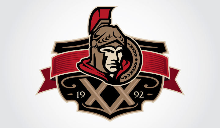
Now Jacob is back with some more insights into his involvement with the Sens last year. He tells me that the club commissioned him to design a 20th anniversary logo — one they unfortunately didn't use in the end. Take a look.

It's very unfortunate this logo got left in the dust. It's absolutely perfect. Here's what Jacob tells me about the design:
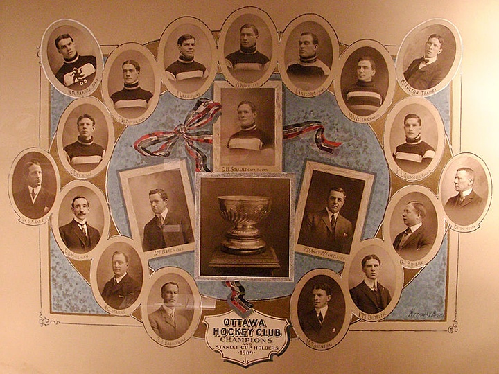
Because they were celebrating their 20th but also celebrating their whole history last season, I was asked to incorporate modern and vintage elements, with the Senators current logo as the main one (i.e. not the =O=). So the background of the logo is from this 1909 Stanley Cup holders poster.
That may be the coolest part. Take a look at the poster from which he took his inspiration.

Why, Ottawa? Why?
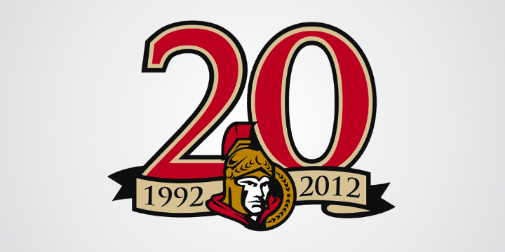
To jog your memory, here's what they actually used last year.

Just doesn't have that vintage feel, does it?