Las Vegas Wranglers Launch New Logos

We may be light on new NHL logos and uniforms this summer, but the same can't be said for the minors. Today, the ECHL's Las Vegas Wranglers unveiled a brand new set of logos.
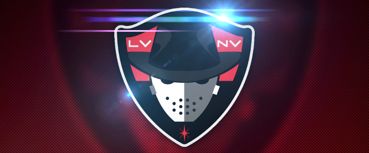
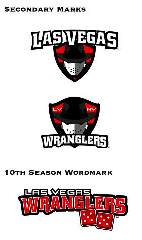
 The Wranglers are celebrating their 10th anniversary in Sin City and have decided a revamped look is in order. Gone is the shadowy cowboy and his bull. In its place, well, what the team is still calling a cowboy — wearing an old time hockey mask.
 Have to be honest. His head covering looks a lot more like a fedora than a Stetson. Combined with the creepy mask, that's almost unquestionably a Freddy/Jason hybrid depicted in that logo. And overall, it does feel like a downgrade from the Wranglers' previous visual identity.
Las Vegas joined the ECHL's ranks as an expansion member in 2003. So 2013 marks a decade in action. And while I may not be able to offer a glowing review for the new primary mark, I absolutely love the creativity behind the 10th anniversary mark — fives on a pair of dice. When have we ever seen an anniversary logo do anything so outside the box?
The two secondary wordmark-infused logos show us that the Wranglers are retaining a portion of their original identity. Basically, the font's not changing.
So how is the team spinning their new look?
“It’s a simple and bold new look to celebrate a terrific ten-year run in one of the greatest cities in the world,” said Wranglers president and COO Billy Johnson.
“We have always striven to bring a major league caliber experience to Las Vegas through sights, sounds and entertainment, and the new branding is the next step up.”
I don't know if a couple of logos can really do that, unless they think people are less likely to buy a ticket with John Wayne on it.
So it is certainly a simple design and that always wins points in my book. I just wish it looked a little more like a cowboy. What's your take on the new look?