Providence Bruins Update Logos

The parade of new minor league logos this summer continues with the AHL's Providence Bruins, who made their updated look official on Monday.
The new primary and secondary marks have been in use on the team's alternate jersey since 2010 and the upgrade is a welcome change. And it's all about simplifying the club's look, which is derived from its NHL affiliate, the Boston Bruins. Presumably, that third jersey will become the primary dark sweater now alongside a new white one.
The new secondary logo is based on the mark used in Boston since the Bs' 2007 facelift.

Founded in 1992, the Providence Bruins are celebrating their 20th anniversary. Perfect time for a sharp new identity. Even if it isn't completely original. Here's a blurb from the press release:
This new logo also represents a fundamental shift in focus for the Providence Bruins brand towards a more traditional, “old-time hockey” look and feel. This move coincides with the 2013 Dunkin’ Donuts AHL All-Star Classic, hosted by the Providence Bruins the weekend of January 25-28, which also reflects the new direction of the team’s visual identity.
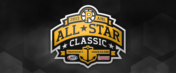
Ah, yes the 2013 AHL All-Star Classic. We have the logo for that, too.

No surprise it features the Bruins' new refined spoked P logo. It's a really nice All-Star mark, actually. Too bad it had to be marred by a corporate sponsor who's colors are neon orange and hot pink. So how do you feel about the new look of pro hockey in Rhode Island?