Sabres Debut New Uniforms!
 The Buffalo Sabres introduce new home, road and alternate jerseys today
 It's official. Years of work have paid off for the guys at Sabres Not Slugs — a hardcore group of fans on a mission to rid their team of the infamous "Buffaslug" logo, instituted in 2006.
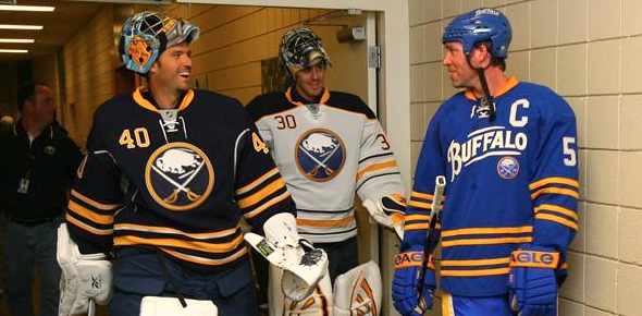
Today, the Buffalo Sabres unveiled new home, road and alternate jerseys for the 2010-11 season — and the old logo is nowhere to be found. In fact, the new sweaters show a shift by the team back to its original identity.
 Thomas Vanek #26Where to start... First, the previous third jersey, introduced in 2008, is the new standard home sweater. No surprise, and it's a welcome change as this is a spectacular hockey uniform. Even better, the Sabres will double up on this solid design by wearing a white version for road games.
Some fans have bemoaned the heavy use of navy blue, but let's be honest: this is 2010, not 1980. Bright colors are better in small doses. And that makes the new alternate sweater perfect. The bright colors are a great change of pace and superb tribute to the past.
And BUFFALO across the front, an homage to the town's original pro hockey club, couldn't be better suited. After years of new logos that have failed to catch on with fans, this was exactly the right play for the Sabres. Celebrate the city, its hockey history, and stop trying to reinvent the wheel.
In a single day, one of the NHL's worst-dressed clubs has become one of the best. It's an outstanding set of sweaters. Most teams would be lucky to look this good.
 Unique features on the back of the thirdA release on the Sabres website details some interesting facts about new third jersey:
- The royal blue color of the third jersey reflects the original Sabres jersey that debuted in 1970.
- The “Buffalo” script wordmark was inspired by the old Buffalo Bisons “bottlecap” logo.
- The choice of an off-white color for the Buffalo script was to give the jersey a vintage feel.
- There are four stripes on the sleeves, socks and around the waist that represent 40 years of Sabres hockey.
- A commemorative 40th anniversary “1970” logo sits below the Buffalo script.
- The faux felt numbers have a unique cross stitched pattern in reference to early pro hockey jerseys.
The new third jersey will be worn for 12 home games this season, including its debut on Oct. 9 for the Sabres' season opener when they host the New York Rangers at HSBC Arena. Seems 10/9/10 is going to be the night for retro sweaters in the NHL.
According to the Sabres' website, "the design for both jerseys was a collaborative effort between the Sabres and Reebok International." By the way, they also have a complete photo gallery of today's unveiling for your enjoyment.