New Logos Unveiled, More Coming?
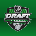
 The NHL and the Minnesota Wild unveiled the full version of the 2011 Entry Draft logo on Tuesday. It's very green.
The NHL set a new standard for draft logos with the 2010 edition, hosted by Los Angeles. The basic version of the mark features the word "draft" in big block letters above three shooting stars which identify the host and year.
The full version features elements that represent the host in some fashion. The Los Angeles logo, for example, features palm trees. The new Minnesota logo contains a wilderness scene. But my description hardly does it justice.
The best description can be found on the team's own website:
For those of you who live out of state, we here in Paul Bunyan's home state love us some trees, and some lakes. This logo has both, with pine trees surrounding a lake with what appears to be a brilliant sunrise coming up over the horizon. The primary color is the forest green seen in the Wild's third jerseys.
Another difference: While the full L.A. version was encased in a circle, the Minny one here is more of a shield. Will they stick with the shield in 2012 or keep changing up the shape? Not really a question that demands an answer. At least not until next year.
By the way, this was pointed out by a reader. For anyone who ever thought the Wild's third jersey looks like a baseball uniform. Guess what.
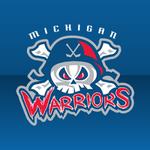
 The newest member of the North American Hockey League just unveiled a brand new logo. Welcome the Michigan Warriors.
Technically they're not a new member. They were the Marquette Rangers until this week. The junior club has now made the 400-mile move to Flint, Mich. for the 2010-11 season and given us a brand new logo to enjoy.
It's a little cartoony, but it is a junior team. And to be fair, it's a solid, fierce-looking mark. You could do worse with some of the stuff teams have come out with lately. (Yes, I'm talking about the Pensacola Ice Flyers. I'm always talking about the Pensacola Ice Flyers.)
Read more about the change-over at the NAHL's website. And find more details on the team at MyWarriors.net.
 One more thing. Scott K. writes in tonight to say it looks all but official that the Lowell Devils are headed to Albany — once again placing New Jersey's AHL farm club in New York's capital district.
Tom Gulitti posted the following on his blog, Fire & Ice:
It appears an agreement between the Devils and the Times Union Center in Albany to move the team’s AHL franchise back to New York’s capital will be finalized in the next two days. The Devils submitted a letter of intent last week to move the team to Albany for the next five seasons, but some details still had to be worked out about improvements to the arena that the Devils are seeking.
“Nothing is complete yet,” Lamoriello said. “Hopefully, we’ll have something by the end of the week the latest.”
So it's not full-on official, but it's looking more like they'll be the Albany Devils starting in the fall. And that means a new logo for us to drool over. Here's the thing, though. I'm betting they pull the Trenton nonsense. It's going to read ALBANY arched above the New Jersey Devils logo with devil horns on the A and Y.
Stay tuned to see what happens.
 There was one other item I accidentally left out last night. A new Twitter account named @OKC_Barons popped up on Tuesday claiming that the Oilers' revived AHL franchise will be called the Oklahoma City Barons.
Haven't been able to track down any confirmation of this, or even a second source. Verifying the legitimacy of the account is pretty much impossible at this point. But I guess it's worth keeping an eye on anyway.
There have been two tweets, both posted around 8 PM on Tuesday.
OKC_Barons YOU HEARD IT HERE 1st: The Oklahoma City Barons will be the new Edmonton #Oilers AHL affiliate starting in the 2010/11 season. #AHL #OKC
OKC_Barons The official name announcement will be in a few weeks. Until then... who's excited for the Oklahoma City Barons? #AHL #OKC #Oilers #NHL
Again, can't vouch for the validity so take it for what it's worth.