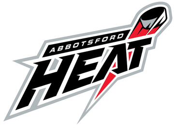
Heat Unveil New Logo
Words I love to write: "unveil... new... logo." Always exciting.
Yes, legitimate Icethetics news coming in today! The Abbotsford Heat, the newest addition to the American Hockey League unveiled their new logo this morning. And despite my hype in the previous graf, it is rather unremarkable. I mean, I looked at it, started writing this post, and had to look at it again to remember what it looked like.
See for yourself.
Now then, some of us may need a quick history lesson (I know I did). Who are the Abbotsford Heat and when did they join the AHL? The Heat is just another in a long line of aliases for a team I'm not entirely convinced isn't in witness protection.
This franchise began life in 1987 as the Utica Devils, the natural minor league farm club of the New Jersey Devils. That lasted only six years, until Calgary Flames took over the team in 1993, moved it to Saint John and shared its own moniker. The Saint John Flames lasted a full decade before it all hit the fan.
In 2005, following two years of absence from the league, the club was reestablished in Nebraska and were re-dubbed the Omaha Ak-Sar-Ben Knights. ("Ak-Sar-Ben" being "Nebraska" with some hyphens in your rear view mirror.) After two seasons, the franchise was relocated to Moline, Illinois and reunited with their parent club's nickname. Known then as the Quad City Flames, they were responsible for the immediate death of the UHL's Quad City Mallards, who had occupied the same arena for the 12 years prior.
Now for the worst part. After just two seasons in Moline and two stints in the American Midwest, the Flames ultimately decided that it really wasn't for them. This fall, the AHL's globe-trotting club returns to Canada once again after a zig-zagged trek across the continent. For the record, it's been 4,888 miles of relocations and counting. (If you're really bored, I've mapped it out for you.)
Now, about the logo from before that by now you've forgotten about. Go look at it again real quick. Responsible for the rather banal basketball-esque logo is a local company called Domain7.
The alleged lead designer Stephen Bau excused the drabness by saying, "We wanted to capture the essence of hockey and position Abbotsford as a destination for world-class hockey in the logo and branding."Before you assume he's about to follow up with an apology for failing, he goes on by saying "and I think we were able to do that." Out of curiosity, do you think he's actually seen it?
Furthermore, I was ready to express my sympathy for the fans of Abbotsford before I read that they voted for the name! Really? The Heat? Miami can get away with it. Your average high for the year is 74 degrees. Unless it's irony. And then it's funny. But I think we all know you aren't that clever, Abbotsford.
Not that you'll necessarily want to see it, but Heat's web site is claiming to offer a behind-the-scenes look at the development of the new brand. Someone actually wrote the following line describing this logo: "the movement of the puck looks somewhat like a flaming comet." Really playing it fast and loose with the phrase "looks somewhat like," aren't we?
Not even joking about that.
Anyway, I apologize if I've been a little harsh this afternoon on this, my first logo unveiling since the return of Icethetics. But I'm just unimpressed. I will say one thing in its favor, however. I'd sooner buy something with a "flaming comet" on it than that horrible Quad City Flames logo.
Anyone else have an opinion?
Thanks to Ian for the tip.
