Blackhawks Unveil 3rd Jersey!
First, huge win for my Bolts tonight over the Rangers — despite the shutout-spoiler with two minutes on the clock.
 As expected, the Chicago Blackhawks today followed in the footsteps of the Pittsburgh Penguins and revealed their new third jersey to be that which was designed for last season's Winter Classic. But there was a twist.
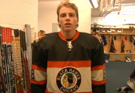
But before that, a video on the Blackhawks' web site served as an unveiling of sorts. We watch Patrick Kane, Jonathan Toews and Marian Hossa struggle to wrap the new form-fitting jersey over their bulky gear. Seriously, it's the worst video I've ever seen an NHL team produce.
 Patrick Kane tries on the Blackhawks' new third jersey
Look how uncomfortable he looks. Anyway, beyond that, what do you notice? Check out the shoulders.
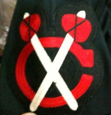
 New colors for the tomahawk logoThe classic tomahawk logo has been been altered to match the red/tan/black color scheme of the new alternate uniform. This was a feature missing from the Winter Classic version.
I think it brings the whole uniform together quite nicely. I've always been a fan of this particular secondary logo and I'm glad the Hawks have found a way to freshen it up and keep it around for this new look.
The Blackhawks have also announced a 12-game schedule in which the new sweater will be worn. It makes its on-ice debut this Tuesday, December 1 when they face the Blue Jackets.
It sees the majority of its 2009-10 action late in the season, during six games in March. The full schedule can be found on their web site or in the Icethetics calendar found in the sidebar.
One more note tonight, also related to the Central Division.
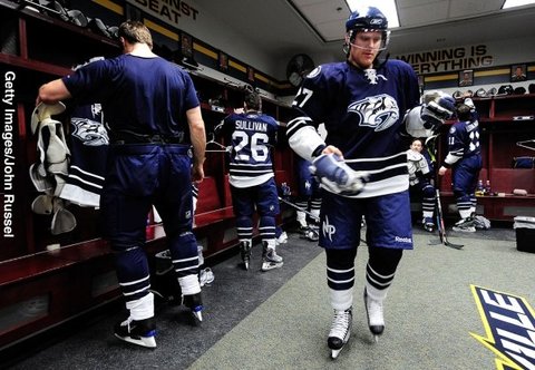
 Icethetics reader Jon writes in to point out something surprising in the Nashville Predators' new alternate uniforms — which made their debut tonight.
Check out the picture below and you'll see a third new logo on this uniform. Specifically, look at the pants. There's a stylized "NP" lettermark there — something we're seeing for the first time.
 A new NP logo is featured on the alternate uni's pants
When the jerseys were first unveiled, the players were not wearing these pants so today was our first chance at seeing them. I've yet to see an up-close or high-res version of this logo, but from this perspective, it doesn't look like anything that's currently part of the Preds' design package.
It's not a big deal, but certainly worth mentioning. Thanks to Jon for picking that out. If I learn anything more on the subject, I'll keep you posted.
By the way, a quick note on comments. If you guys want to ask me a question directly — whether it's related to the topic of the post or not — don't bother putting it in the comments. I will read and respond to it only if you email me at icethetics@gmail.com. Thanks!