Blues, Blackhawks & Blue Jackets
Hope you guys are psyched for the Center Ice Tournament. I've been busy getting that prepared but in the meantime I did promise you concept art. Today's theme is the Central Division.
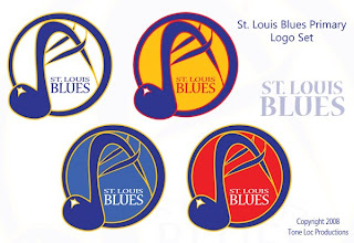
First up, the Blues — in an assortment of different colors.
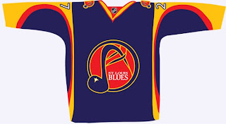
These logos have a very different feel to them as well because of the hand-drawn look. The NHL has never really done anything like this. Also, there's a jersey to go with them.
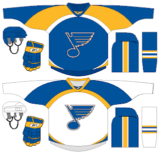
But back to a more simplistic approach, what about a striping pattern on the jersey that alludes to the Gateway Arch?
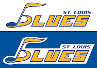
Here's an interesting wordmark.
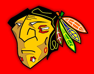
Next is my favorite subject, as you know, the Blackhawks. The designer tells me he came up with this logo around the time the Senators first introduced their 3Dish logo. You give the Indian head a quarter turn and he might look something like this.
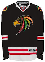
I like it a lot — maybe not as a logo, but just in general. Plus, remember this logo? Somebody put it on a jersey.
Not bad at all.
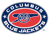
We'll finish things up here with the Blue Jackets. Here we're replacing the hat with a cannon on the secondary logo.
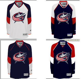
And here's a variety of color patterns for Columbus' jerseys.
Nothing really jumps out at me (in fact, it took me a minute to notice they were all different).
Don't forget, tomorrow you'll get your first look at some of the logos designed for Project: IHA. I can't wait to post them and get your feedback. Plus the Center Ice Tournament bracket will make it's debut. So there's a lot you won't want to miss.
