Freak Out Friday XL
This is the 40th installment of the Freak Out Friday series. And the Roman numeral for 40 suggests I'd better have an extra-large helping of freaky hockey artwork this week. Let's hope I can deliver.
The biggest real-life freak out of the last couple weeks has been the public unveiling of the Iowa Chops along with their new logo. But someone's made an improvement.
(Apologies for the low image quality, but this is what was sent to me.)
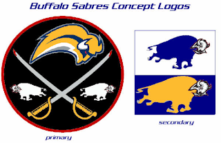
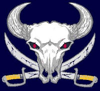
It seems that with the Buffalo Sabres, when it comes to fan made concept art, you either love it or hate it. I wonder what you guys will think of these.
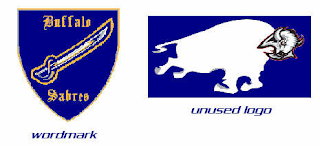
But wait, there's more.
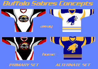
There have even been jerseys designed for them.
And more along the lines of Matt's recent rebrand of the Stars, check this out.
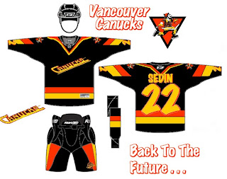
Something else I got this week that made me chuckle were concepts for the Vancouver Canucks.
Don't get me wrong, I appreciate the effort someone put into this but wow, you can't help but shake your head in amazement.
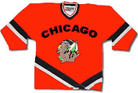
Here's a concept jersey for the Chicago Blackhawks.
Don't shoot the messenger.
Sometimes folks send in team-branding concepts that miss the mark a little.
I can only imagine the nightmares the children of Cleveland would have to endure.
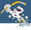
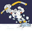
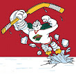
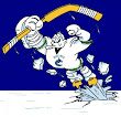
Speaking of nightmares, if you recall about a month ago I started a series within a series for the Freak Out Friday. One reader created 30 logos based around the Mighty Ducks' third jerseys from the mid-90s — one for every NHL team. Last week I posted the Atlantic Division and the week before was the Ducks' own Pacific. Today we're going to the Northwest.
Be sure to notice the half-stripes on the Oilers logo. Yes, all of these are based on last year's new Rbk EDGE jerseys.
And that's all folks. We're back with another Freak Out Friday in two weeks — assuming you get all your ridiculous artwork sent in! My big thanks to everyone who's submitted work — good and bad alike!
