Improving On The Chops
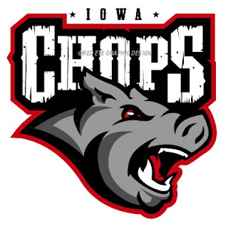
Two weeks ago I posted the new name and logo for the AHL's Iowa franchise — the Iowa Chops. While the name remains an abomination, someone actually came up with a decent concept logo.
credit:
Red Eye Graphic Design
This is a great example of how you can create a great logo even when saddled with a crummy name and overused colors. Too bad it will never see the front of a jersey.
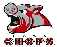
For reference, this is what the Chops are actually using.
Thanks to Charlie for the tip!

