Reworking Logos
It's time once again for some concept art. Today we're looking at reworking various team logos. Some with good results, others not so much.
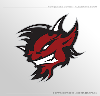
We'll start with an alternate logo concept for the New Jersey Devils. It bares some similarity to an idea created by Matt for his Rebranding the NHL series. Only this one is graphically simpler.
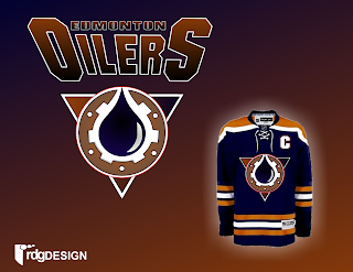
So that's pretty cool. We've also got an Edmonton Oilers logo here.
Nice, effective, but a complete disregard for the team's logo history and not modern enough to warrant it (like the gear logo on the old third jersey).
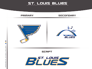
Got something new for the Blues as well.
Interesting turning the note into a hockey stick but the secondary is just to intricate to form a great logo. Nice idea, though.
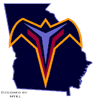
That's a simple concept but one that need never see the light of day. I think to some extent, incorporating the state or provincial outline works but not in every instance.
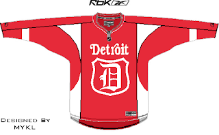
We'll finish things off with some new looks for the two teams currently battling for Lord Stanley's Cup. By the way, is it just me, or does it seem like they're dragging this series out with all the days off in between games?
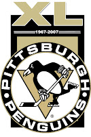
A simple flash to the past there. And with the Penguins celebrating 40 years in the NHL, one reader submitted a unique commemorative logo paying heed to the club's history.
Overall, a decent, if not above average, batch of concept art for you today. By the way, I've got a new series I'm kicking off on Wednesday. Tune in then to see what that's all about. (Just remember, I like alliteration.)
