Something New For NYR
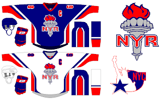
I've always been a proponent of updating the look of the New York Rangers. Classic schmassic. And while I can't deny theirs is among the most recognizable of hockey uniforms, I can't help but think how much better they'd look if they made the Statue of Liberty logo a permanent fixture.
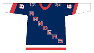
You see what I mean? Despite the crest and shoulders, they still look like the New York Rangers to me.
But if you really want to go nuts — and I love getting stuff like this emailed to me — you could rethink their look completely.
Though I'm well aware of the taboo nature of something like this, I can't help it. I still like the Lady Liberty design better. But this design certainly has its redeeming qualities — maybe not so much the secondary logo.
However, here's the mistake some might be tempted to make when discussing and update for the Broadway Blueshirts.
Resist that temptation.


