Logo Adjustments For 'Hawks
Got a quick concept post for tonight. No new polls until Sunday when the fourth round of the Quest for the Worst begins.
You already know that I'm not a fan of what many would consider to be one of the best logos in all of sports, so I won't get into that. But I do have proof that I'm not the only one who feels that way about the Chicago Blackhawks. A couple of people made some interesting "adjustments" to the logo and uniform.
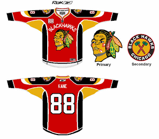
We'll start with the uniform.
And while I do recognize this particular design might be more worthy of the Freak Out Friday post, I'm putting it here. I personally wouldn't consider it an improvement, but you be the judge.
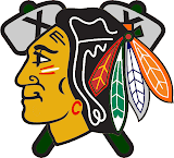
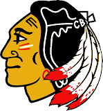
These next two logos keep mostly in the spirit of the current logo.
I'm more partial to the design on the right. It's always interesting to me to see what you guys come up with.
By the way, I'm moving this weekend so don't be too surprised if there's little to nothing posted over the next several days. I will, however, try to get a Freak Out posted at some point tomorrow.


