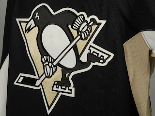
Penguins Unveil New Uniforms!
The Pittsburgh Penguins have officially unveiled their new Rbk EDGE uniforms tonight!
The first thing you'll notice is the shoulder patch featured the recolored '90s logo is absent. I think some Penguins fans find that to be an upgrade. Though the general consensus seems to be that the jerseys are an overall downgrade.
 From the side and back views, you can see the striping along the sides that coincides with the leaked images we saw back in July. Even the giant numbers on the back match. And maybe it's just me but those numbers do seem awfully large. Not a complaint, just an observation.
Not a bad uniform set, overall, if you ask me. Plain but elegant. And no matter what, you can't please everybody. You'll always have your critics. But personally, I offer kudos to the Pens for not going overboard.
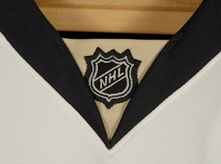
Before I take off, have a close-up look at the road jersey collar complete with the NHL logo.
And as always, you can find more photos of these new sweaters at my official Rbk EDGE gallery. Enjoy your night, Pens fans!
 UPDATE (7:07 PM): A lot of you have been wondering what the new special shoulder logo looks like. This photo of Maxime Talbot modeling the new road jersey shows there's a patch there but doesn't offer a very good look.
When I come across a better photo, I'll post it right here.
UPDATE (9/6 2:21 AM): Thanks to everybody who emailed in this photo while I was asleep last. For anyone who hasn't seen it yet, have a look for yourself.
Here you see Talbot signing an autograph with a shoulder patch that reads "Pittsburgh 250" — not a 40th anniversary logo. Though I'm not even sure I'd go so far as to call it a logo. That's not a dig, I'm just saying.
Anybody know if that patch is on both shoulders or just the right? Seems like every photographer there was confined to the left side of the room because all the angles I've seen only show the right shoulder clearly.


