Capitals, Here's How You Fix It
The sixth entry in the Here's How You Fix It series will take a look at the Washington Capitals' new duds.
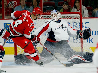
One of seven teams to introduce new or updated logos, the Caps we the route of the old days by creating a wordmark logo that harkens back to the 1970s and the arrival of the team on the NHL scene. Now it may just be a personal complaint I'm voicing, but I don't really understand the striping patterns on the new sweaters. They just do something strange along the arms and sides if you ask me.
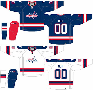
So in the interest of considering a more traditional — heaven forbid — striping pattern, I thought I'd post this concept which was emailed to me by a reader.
The striping is simple and I love the stars on the shoulders. I also like the Capitals in blue as opposed to red or black — like the had been wearing. Another neat aspect of this concept is that the colors of the logo are swapped for the home and road jerseys. Little things like that are what make me like a uniform.
How do you feel about it? Leave your comments below.
Coming up: San Jose Sharks.

