Ducks, Here's How You Fix It
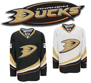
/We're working our way through the less accepted jerseys that have been introduced at the hands of Reebok this offseason. Today we're addressing the Anaheim Ducks, specifically.
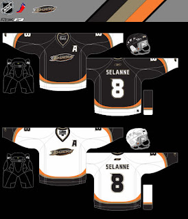
One of my pet peeves is wordmarks passing themselves off as logos. So you can imagine my disdain for the Ducks' new logo when it was introduced last summer. Now it's the smallest crest on any of the new Rbk EDGE uniforms (Dallas' home sweater doesn't count because that's another animal altogether). So here's a simple fix.
How hard would that have been? Really? So disappointing.
But let's just say for the sake of argument that this suggestion is too drastic. What about this?
It's very subtle, but adding that black oval behind the wordmark does wonders for it. If you ask me, it doesn't do enough, but it's definitely better.
Am I way off base here? Ducks fans, do you approve? If you have any suggestions yourself, email me and you might just see it posted here one day soon.
Coming up next: Edmonton Oilers. And Oilers fans, you aren't going to want to miss it. Man, did your club miss the boat on this one. Knowing you guys the way I do, you're going to love it.


