Thrashers, Here's How You Fix It
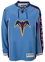
The new Fix It series has contemplated jersey repairs for the Vancouver Canucks and Colorado Avalanche. It continues today with some suggestions for the Atlanta Thrashers.
Prior to switching to the light blue jersey full time, the Thrashers actually had a completely different logo for their dark jerseys. In fact, it was this one.
Not bad, but liked the dark blue jerseys better with that logo.
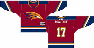
In going through comments about the new uniforms, I got the idea that a lot of folks (mostly those who are not Thrashers fans) don't like the light blue or ATLANTA written down the sleeve. So on a completely different tangent comes this design.
This isn't in the Rbk EDGE cut, but still worth a look, I felt. I like the thrasher head for the logo. In fact, I think that's essentially the logo worn on the pants of the current uniform. I also really like the maroon sweater. Overall, a nice effort. I bet this would make for a very sharp-looking sweater.
Have you guys got any other suggestions for the Thrashers or any other team? Email me at nhllogos@gmail.com.
Next up: Anaheim Ducks.

