Toying With TML
I don't know why I've been skimping on the concept art posts. I have plenty of stuff to share. Tonight, we're going to take a look at the Toronto Maple Leafs logo. I'll be the last person to say it needs to go, but I'll be among the first in line to call it dull. (Consider its early exit in the tournament.) In other words, dull logos are all right for teams with a history as rich as these guys.
Now having said that, let's mess around a little. Seems like the Leafs have always have a logo that featured a leaf. Makes sense. But a few years ago they introduced a secondary mark that wasn't shaped like foliage. If I'm to understand correctly, it was met with disinterest by fans. Many were happy to see it go when the Leafs unveiled their Rbk EDGE jerseys recently.
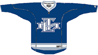
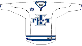
So to those people, prepare to have your eyes assaulted by this.
It's just the skeleton of an idea someone had. Not a bad idea but it needs some work. No matter what, a leaf needs to don the crest of both main jerseys. However, I don't see why these couldn't work as an alternate sweater.
Something cool I ran across a long while back is this logo.
The TML actually forms a leaf. The leaf. Very creative if not slightly awkward to look at. So what about this?
I think there are enough logos enclosed in circles and this probably wouldn't work on a jersey, but there it is anyway. It sounds like I don't have anything good to say about any of these designs, but that's not true. I like them to some degree but I'm not oblivious to why they wouldn't work. While I understand the double-lines in the logo above, it just seems empty.
Anyway, what do you guys think? Does the leaf need some work? Or is it untouchable?


