Looking Ahead: Third Jersey Concepts
As we all know, the NHL is abandoning the third jersey program for this season. However, there are many indications that it will make a comeback as early as the 2008-09 season. Having said that, some people are getting a jump on things. Here I have a few alternate jersey concepts to share.
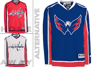
We'll start with the Washington Capitals. While the return to red, white and blue has grown on me, the wordmark logo has not. However, they've got a great shoulder logo that could use a little more mileage.
I especially like the idea of a blue jersey. Moreso than the red. Kudos to the designer on this one.
Keeping it in the Southeast Division, I've also been sent some Tampa Bay Lightning art.
Speaking as a Lightning fan, I do like the idea of a blue alternate jersey, but the logo needs the circle. What do you guys think of that? I think it looks even plainer without it.
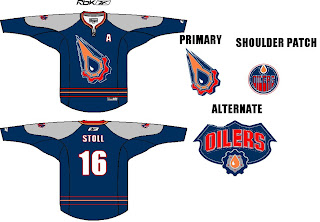
Moving on to the Northwest, check out this rather colorful Edmonton Oilers rendering.
I like the gear logo better in silver. But that's just me. Let's finish up with a look at some Minnesota Wild concepts.
I remember back in 2000 when the Wild first unveiled their logo — the crest you see on these jerseys — and I was horribly afraid the jerseys might look like this. (I was thrilled by the bear head logo.) However, I kind of like the green as an alternate for some time in the future. Might be a little much though. Thoughts?

