Your Daily Dose Of Canucks
You'd think my favorite team was the Vancouver Canucks the way I post about them. (Actually, the Lightning are as you know and I have lots for them later on today!) Anyway, I think it's just that Canucks fans are the most curious about their team's new logo and uniforms based on their decades old identity crisis.
Epitomizing that identity crisis is the mish-mash logo I posted on Tuesday. But the designer of it made some adjustments and improvements in coloring. I think they're worth a look so I thought I'd post that.
Drool over that, Vancouverites! And try and convince me you wouldn't give your left nut to have your team wear a jersey with this on the crest. Anyway, in all seriousness it's a very clever design. Whoever designed it needs to work for Conan O'Brien.
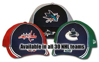
In addition, the Hockey Hall of Fame web site apparently leaked the new Canucks logo on a hat.
While the primary logo seems to lack green, it certainly seems to be a part of the overall team colors. It also appears we should expect the old stick-in-rink logo on the shoulders as a secondary.
That's all for today. Until the next time, enjoy this look back at the history of the Vancouver uniform, courtesy of Canucks.com.


