Time To Get Your Blackhawks On
All right, if you've been reading my nonsense in the tournament matches, I have good news and bad news. The good news is, today was the last day of that. Reader voting starts Sunday. The bad news is somebody else, it turns out, thinks the Chicago Blackhawks could use a logo upgrade. (See, I'm not the only person who doesn't think it's the best in all of sports.)
Now I'm not saying this design is totally the way to go. I think it's a good start, but also that it could use a little work. Sneak a peek.
Don't freak out! It's just fan-created concept art. It's not a real 'Hawks logo by any stretch.
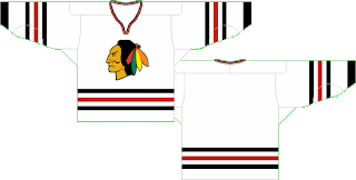
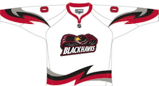
But that, I'm a little more impressed by. I still think a team's logo should be dominated by its primary colors (here: red, black and white), but this wouldn't be all bad. Well, at least as far as I'm concerned, it wouldn't. What do you guys think? Should I take the advice of John Tortorella and shut my yap on this subject or could we have something here? While you consider, check out these jersey designs.
Oh, and just to freak you out a bit, somebody emailed me this concept.
Now lay it on me. I can take it.


