Covered In Coyotes Concepts
I feel like I've been ignoring the Phoenix Coyotes fans out there. This is certainly not intentional. There just hasn't been a lot of news to post for them. Until today, that is. I've scoured the far corners of cyberspace for a few images you might find beautiful or repulsive — or something in between.
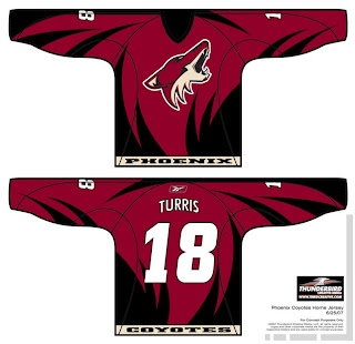
This design was created by someone who designs the outsides of racecars, I believe. Anyway, it's really quite — something. I couldn't see them wearing anything like this because the whole reason they changed their logo was that they wanted to go the classic route and simplify everything.
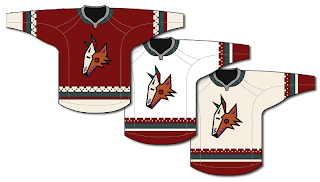
Well, to me, that was a sad thing. One fan designed this jersey set in memory of the old days when the Winnipeg Jets first arrived in the desert.
It's got that desert Indian look that was very cool. This design uses only the head of the original Coyote logo. It was first seen by itself on the green third jerseys they had for a short time. This is closer to what they actually wore in those days.
 The big difference being that the Coyotes wore black dark jerseys, not maroon like they wear now.
I haven't seen any Rbk EDGE jersey concepts based on their current logo and uniform design, but haven't you heard, horizontal stripes are so out. Seriously though, don't be surprised if it comes out looking like the Capitals or Blue Jackets new jerseys.
It'd be nice if the league would unveil more of the new uniforms. Chances are we've still got another month ahead of us before we start to see the rest of the teams trickle out. Anyway, Coyotes fans and others alike, what do you all think of these designs?

