New Blackhawks Jersey Design Concept
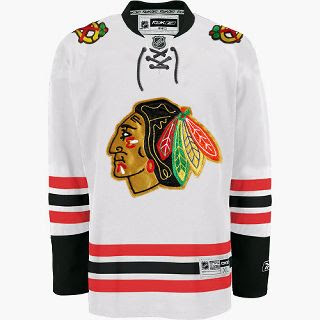
We haven't been hearing much about the Chicago Blackhawks lately, but I came across this design on the 'Hawks official message board. Have a look.
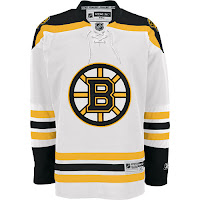
Now, have a real good look. I mean get out your fine-tooth comb and really go over that puppy because I have my doubts as to the veracity of this image. It sure does look like a Blackhawks Rbk EDGE jersey, but the first thing that caught my eye was that familiar horizontal striping pattern on the sleeves and bottom of the sweater. Remember this?
 Now compare it to the Bruins jersey to the left. Dead on. So I'm sorry if I got anybody's hopes up. It is just a very good Photshop job based on the B's road Reebok sweaters. Wondering what tipped me off? The stripes on the Blackhawks' white jerseys go black-red-black whereas the ones in this image go red-black-red.
Anyway, I'm continually impressed by the work people put into these jersey designs. You gotta think I'm pretty interested in the subject on account of writing this blog but I'm not sure I'd really go to the extent of coming up with my own design concept. Kudos to the folks that do, though. They give me something to write about.
The Blackhawks have yet to give word of plans for any sort of formal or official announcement, so until we hear something, it's a cool idea to muse on. Any Chicago fans reading? What do you think?
