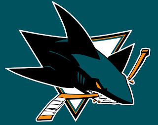
Sharks Unveil New Logo!
It's here and it's real. The leak proved right. This is the new logo of the San Jose Sharks.
For my money, it's a huge improvement on a good logo that needed a little help. While I don't love the hockey stick in the logo, I understand the team didn't want to completely revamp their image, merely improve upon what they already had. At the press conference, the Sharks only unveiled the new logo set, no uniforms have been shown at this point.
The club also unveiled a bunch of secondary marks including the new shoulder patch and shield, seen above. All of these logos and more can be seen on the the Sharks new web site.
We've had a few weeks to ponder it thanks to the leak, but now that it's official, what are your thoughts? Did the Sharks make the right choice by updating what they had? Or would they have been better off revamping the look altogether? Comment below.


