HF&P, Part 11: Dallas Stars
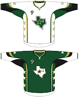
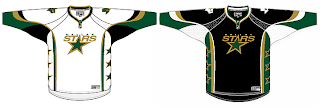
The "Hockey Fans & Photoshop" series pushes forward with a pair of designs a couple artists came up with for the Dallas Stars.
This is probably the most expected version of the new uniforms for Dallas. But personally I'd like to see a change in the logo. Nothing drastic, just an update. They have great colors but I feel like they could use a better logo.
 And when I say that I do not mean what you see here to the right. I believe this design was rather ill-conceived. While it would be a welcome change to see a new crest on the Stars' sweaters, certainly this is not the way to go. This is the secondary logo and should stay that way.
Also worth noting in this design is the jersey number located on the front right shoulder. As I've discussed, the Sabres introduced that this season but it doesn't appear yet that the NHL plans to adopt it league-wide.
As far as that goes, I'm guessing the designer of this one also did the Flyers (yesterday). This is relevant only in as much as this person created a secondary logo for Philly. Why not come up with a new one for Dallas while you're at it? I was impressed by the Liberty Bell.
Anyway, we'll find out just exactly what's going down for next season at some point this summer. I can't wait.
Coming tomorrow: the Columbus Blue Jackets.
