Hockey Fans & Photoshop, Part 1: TBL
I'm sure that by now, everyone who's interested has seen the fan-made artwork, predicting the potential new looks for teams all over the NHL next season. The introduction of the Rbk EDGE uniforms has propeled that, and just in case you haven't seen it, I'm going to re-post all of the images here over the next few weeks in a series I like to call — "Hockey Fans & Photoshop" — so I hope you enjoy it. And if you've already seen them, well good for you.
Without further ado, I present to you — the Tampa Bay Lightning, of course. I have to get things started with my team, you know.
I'm a big fan. I thoroughly hate the current Lightning uniform and this rendition is miles away from that. I would like a new logo, however. The whole lightning bolt in a circle just isn't doing it for me.
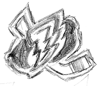
 Hey, while I'm thinking of it, I've got something for you. See that goofball pencil sketch to the right? That pathetic chicken scratch was my feeble attempt at showing what could be done with the logo. Ignore the hockey stick in the background though, I don't think it really works. But notice how I worked in the "T" and the "B" all subtle-like? Yeah, clever, I know.
Anyway, maybe something a little different is what my Bolts need for better aesthetics. I won't buy a jersey until we get a good one. New logo, new uniforms, and I'd even add another color. I like the blue, black and silver — but what about tossing in a dark green or a yellow or something. Liven that sucker up! That's what I say!
But who cares what I say right? More tomorrow.
