Reworking The Oil
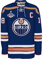
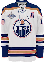
The concept art has been flooding in over the last several days, so it's time to share a bunch. We'll begin with the team whose uniform finished second to last in the NHLToL's Uniform Ranking. The Edmonton Oilers.
Starting with my personal favorite, here. They're much busier in comparison to the current sweaters, but it would be a welcome improvement. Perhaps I speak for myself, though. Let me know. I just think that the Boston Bruins hit it right on the nose with their new sweaters. Why shouldn't other teams have a shot at something similar?
Especially the Oilers.
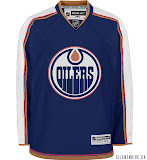
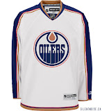
Another sharp design that was submitted seems to be based off of the Columbus Blue Jackets. See what we're getting at here? The Bruins and Jackets finished #1 and #6 respectively, in the Ranking. That has to say something.
Finally, it's not so much a jersey concept I wanted to share, but a logo.
I don't like it as a primary mark, but certainly something similar would be nice on the shoulder as a secondary. Of course you'd have to get past the whole Houston Oilers logo in there. But a little imagination would solve that problem.
So kudos to the artists on all these designs. Really top notch work! Keep it coming, everyone!


