Third Jersey Concepts
In honor of the new Third Jersey Logo Tournament, I've got a fitting theme for today's concept art post. Check it out.
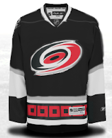
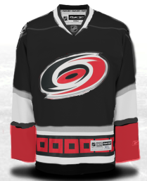
One cool suggestion for a Hurricanes alternate sweater could be achieved by going all black. I say change the black sweater cuffs to red and you've got yourself a winner. As for the Habs, this may not be perfect, but it's pretty damn close. I'm a big fan of this design. I'm curious to see what it would look like on the ice.
But back to black third jerseys, consider these.
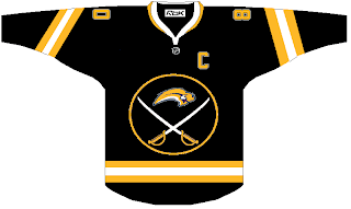
I actually like this. But I was a big fan of the black and red days of the Sabres. They never looked better — especially in those red third jerseys.
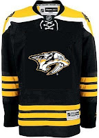
And what about the Predators? Obviously, this design was created entirely based off of the Bruins' new sweaters, but it's not bad. I sort of like the 3D sabre-toothed tiger head, myself. But my preferences have never really been on par with most people. And I'm okay with that.
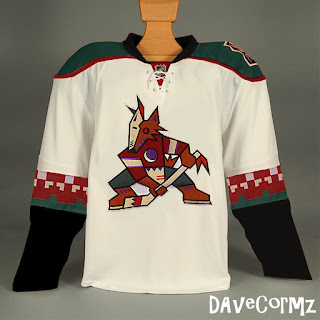
Finally, based off the idea of teams going with a retro look for alternate jerseys, how about something like this for Phoenix?
It's not like I hate the current look of the Coyotes, but I always thought they looked awesome in brick red and green. You have to admit, though, this jersey is pretty sharp looking.
But you probably disagree with me about something. Tell me about it below in the comments.
UPDATE (6:36 PM): Well our lovely designer Michaela got right on it with my suggestion to add red to her Canes concept above. Check it out.
I think it looks great with that small touch. Thoughts on that?
