Johnny Canuck
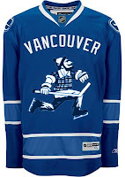
Folks in Vancouver have been hard at work putting together concept art for their team. I'll share some of it with you now.
When the Canucks unveiled their new uniforms a few months ago, I was of the belief that they'd planned to introduce a completely new look and a brand that could last a very long time. Well, that's where this team seems to be really challenged. They need an identity and this logo — among the new marks unveiled this season by the club — could've have been just the thing. I really do hope it makes its way onto a jersey one day.
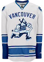
Even one just like this. Although it does stink of Whalerness. Maybe not so much with the silver or something. I don't know.
Or we could just go all out with the old Johnny Canuck logo.
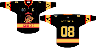
Personally, I prefer that "V" logo. It's just killer. Oh, and where's the green? Perhaps you ought to just revert to the '80s colors.
That's a heck of a jersey. And 08 as a sweater number? Weird. This barely escaped the clutches of Freak Out Friday.
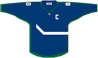
And lastly, there's this.
What say we just go nuts with the crest and wrap it completely around the sweater? That would be interesting if teams started experimenting with something like that. Remember those original Mighty Ducks third jerseys from the '90s? On second thought, maybe not such a great idea.
More later, perhaps.
Oh yeah! Don't forget to get your votes in on the Vintage Logo Tournament final if you haven't done so yet. It ends tonight!
Tomorrow I'll have lots of big announcements on TWO new tournaments beginning next week. That's right, two! Should be exciting! Be sure to check back.


