The Finer Art
A lot of the concept artwork I feature here on a daily basis is created by amateurs. It's fairly obvious and I think even the designers themselves wouldn't take offense to my saying that. But every so often, I come across work that could only have been created by a professional. It's the reason I have a blog like this.
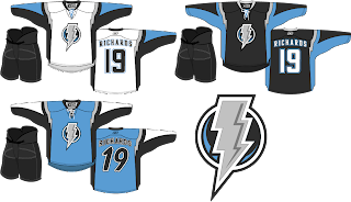
The template used for these concept designs is probably as close to perfect as we're going to get, visually speaking. I don't know the identity of the artist, but the work is stunning. I'll kick things off with my team — which I haven't really talked much about lately.
Personally, I love this idea. A new logo like this would certainly take some getting used to but the light blue on black accented by silver looks great! I'm also a big fan of the throwback numbers on the blue third jersey and the lightning bolts around the shoulders. Anyone feel like painting one of these onto a photo of a Lightning player?
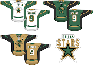
Next here we see an interesting take on the Dallas Stars' logo. I like it but proportionately it seems a bit... off. I think the city name above the logo needs to be in a smaller, wider type. Otherwise, I think the jersey striping looks fantastic and that gold third jersey would definitely get my vote.
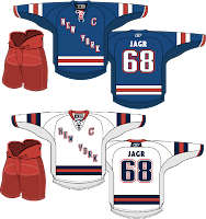
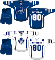
I love the striping on these Rangers jerseys, but the New York across the front isn't working for me. Swap it out with the Lady Liberty logo and I'm pretty sure nothing could compete with that look. I'm a little confused by the Maple Leafs lettering on the back of the jersey, however. Speaking of the Leafs...
The accent striping isn't much but it adds a lot to what are otherwise rather plain jerseys. Will it happen? No. But I think all of these are interesting to consider.
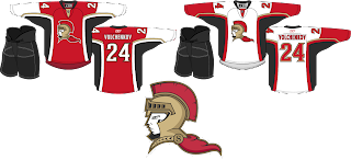
Lastly, we have an Ottawa Senators concept with a complete overhaul.
I think the logo would be better if the cape were either smaller or gone. It creates bad negative space. But once again I think the striping is excellent. Overall though, not a bad direction. By the way, I added Anton Volchenkov to my fantasy team. He hasn't really done anything for me yet.
Anyway, that's all for right now. I'll have some more rather brilliant work tomorrow as we stick to the more professional-looking designs this weekend. Hint: GhettoFarmBoy is back at it again.
