From The Pacific Northwest
I think I'm finally going to be able to start getting back into this again. As you guys have probably noticed, I haven't been as fully involved with the site as I was over the summer. But with all the new Rbk EDGE jerseys out there, I no longer seem to be a useful source of information.
Still, I think we've found a niche with the concept art, so as long as you guys keep sending stuff in, I'll keep posting it. Having said that, here is today's collection. (Let's clock it and see how long it takes for someone to baselessly point out how I "always" write about the Canucks. I love messing with people.)
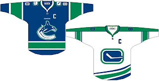
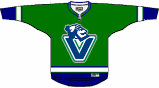
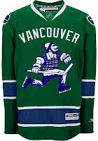
Here's a simple redesign with green incorporated into the logo. It also takes advantage of using different logos for the home and away sweaters. And to go along with that, here's a green alternate jersey.
But an even better-looking green jersey might look more like this.
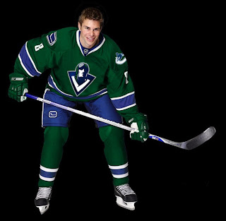
What you see there is the incredibly well-designed logo created by John Slabyk. It would certainly be nice to see a team in a green jersey. White, black, red and blue (orange and teal as well, I suppose) seem to be the only permissible uniform colors for this season.
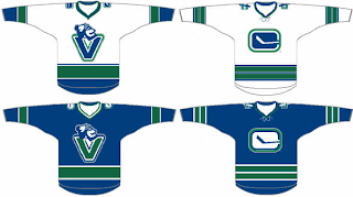
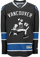
I like the use of the "V" logo so I felt like adding these to the pile.
Worth considering, I suppose. And finally, let's just throw out everything we know and try something totally new. Grey and green.
The grey and blue look awesome together. I think that should be the color of a Lightning third jersey. (Anyone want to put together a concept for me?)
Comment now and let us know what you think.
