Capitalizing On Concepts
Anyone want to guess what Glen Hanlon is thankful for today? Because it's not having a job as an NHL hockey coach. Poor guy. Of all the days to get canned, you just wouldn't expect it on Thanksgiving, right? So with the Washington Capitals opting to replace their coach, I have concept art! (And it's really good stuff, too!)
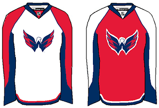
We'll start out with something simple and rather obvious. Take the new secondary mark and stick it on the front of the jersey.
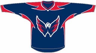
I'm personally of the opinion that it makes for a better primary than the wordmark. But it's not my call to make, now is it? Working off a similar tack, I could totally see this being a third jersey as part of the set above.
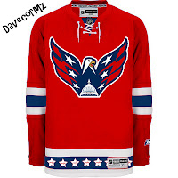
The red striping is a little strange, though. We might want to tone that down a bit. I like it but I don't really know what's going on. I like the next design because it uses a logo that mixes the old and new similar to what we saw in a couple of previous Freak Out posts.
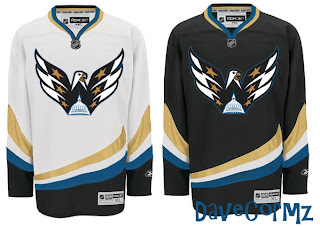
Quite fascinating, really. Though this is probably more worthy of Freak Out Friday by itself, I still like it. Keeping that in mind, however, what about a similar look but with the old blue and bronze?
I think you know how big a fan I was of those colors despite the fact that I completely understand red, white and blue for the Washington, D.C. club. You might also notice that these jerseys are really just recolored Ducks sweaters. But let's finish up the post with these colors.
Other than the Lightning's, there's really no color combination I like more than this. My absolute favorite is that blue one on the right as well as the blue jersey the Caps actually wore in the late '90s. Am I the only one? (If I am, I'm all right with that.)
Hope you guys enjoyed that. I have over 100 graphics waiting to be posted at the moment, so it goes without saying I'm falling a little behind. It also goes without saying that if you've sent in something that hasn't been posted yet, don't lose hope.
Happy Thanksgiving!


