Hurricane Of Concept Art
There's no new poll today so it'll just be this post all by itself. I've had a bunch of Carolina Hurricanes concept art sent to me over the last couple of weeks so I thought I'd gather it all up to share.
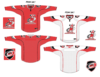
We'll start with a pretty cool rebranding that involves a lighthouse as the Canes' primary logo as well as some slight changes to actual primary.
I don't know, for me, a lighthouse will always say Islanders. I don't know if I'll ever be able to shake that. I do like this logo and uniform set, though. Very nice quality.
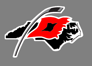
While we're on the topic of redesigned logos, here's an interesting re-imagining of the current secondary mark. I know the team is based out of North Carolina, but does South Carolina also consider the Hurricanes their team since they go by just the Carolina name? Am I thinking about this too much?
It's a nice logo, but it needs some tightening up where the outline of the state is concerned. Way too much tiny detail in their. This would be like a six-inch patch. No need for all that detail. But even if it were the crest, it should still be cleaned up.
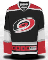
Here are a couple of third jersey designs.
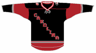
And we'll finish things off tonight with another third jersey concept I found quite interesting.
Classic and what have you. Definitely a Colorado knock-off, but nice on its own merits. You be the judge. Let us know what you think about these in the comments.
By the way, I made wholesale updates to the Concepts Gallery this weekend so be sure to check that out. Added about 50 new images.


