Odd Art, Part I
Do you know how much I love my multi-part series? As much as I write them, how could you not?
Anyway, I'm looking at stuff that borders on being worthy of a Freak Out Friday. Unfortunately, it's not quite there but nor is it to the point where I'd want it to be taken seriously as far as that goes. Don't try and figure out what I just said. It's not worth it.
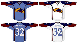
Let's move along. We'll start with the Atlanta Thrashers.
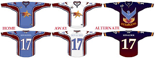
If anyone can work out what's going on here, I congratulate you. And fill the rest of us in, if you wouldn't mind.
Interesting choice going with the old unused Atlanta All-Star Game logo. I kind of like the head logo on its own. That way it doesn't look like the bird is stirring itself in a bowl. Yummy thrasher!
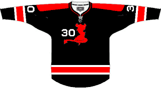
I wanted to let you look at this one before I explained it. It took me a minute, but if you stare at it for a very long time, you'll slowly begin to see the shape of the state of New Jersey appear in there somewhere. Oh yeah, it has horns and a tail. That's probably what's tripping you up. This was spawned along the lines of using state/province outlines in team logos.
Not sure how I feel about the placement of that number on the front, but I would someday like to see a black third jersey for the Devils. That would look pretty killer.
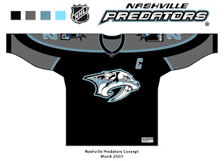
And finally, the Nashville Predators.
This is a very interesting color scheme. However, I think the only way you can really get away with limiting the colors is by first simplifying the logo itself. It's a very detailed mark and all of its colors do work in its favor. But then I've always like the Preds' logo the way it was. Crazy? Perhaps.
I'll have more where that came from tomorrow, if you're good. Eat your peas and don't stay up past your bedtime.


