Double Up!
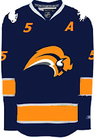
We're doubling up on the concept art tonight. Check it out! We begin in Buffalo with the Sabres.
On the left appears to be a recolored Canucks jersey. Not sure why the artists decided to put upside down buffaloes on the shoulders. But I'm sure the traditionalists will enjoy seeing the '70s logo element on this jersey. Unfortunately, the "slug" is still there.
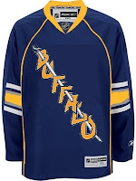
On the right is an element we've seen before. I posted the crest you see here in a Freak Out post from a few weeks ago. I wondered what it would look like on a jersey. Wonder no more. Unfortunately, this concept is based on the new Oilers jersey. And a yellow collar? That's pretty nutty. This might've been worthy of the Freak Out series itself!
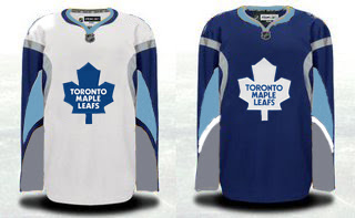
Speaking of freaky Sabres artwork, check out this Maple Leafs concept.
That's just weird, isn't it? Although the splash of color for the Leafs isn't completely unwelcome if my opinion counts for anything (and it doesn't). A simpler solution to the Toronto simplicity problem could be below.
I kind of like that outlined leaf. Not sure about the collar here or the shoulder piping.
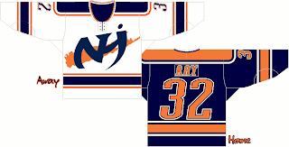
But going back to New York now, I've got a pair of Islanders designs.
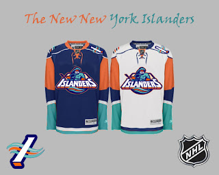
Pretty cool logo. Anyone think this jersey could work as an alternate at some point in the future? It does have a very distinct Oilers feel to it, but that could be fixed by swapping the orange and blue.
And finally, a little something out of the ordinary.
For as much as folks hated the "fish sticks," this is a much better-looking jersey than the current one — at least so says I. However I did like the old lighthouse logo more for the shoulder patch. I just really like that color combination more than anything. In fact, while we're at it, why not go with the lighthouse logo across the chest?
Anyway, what do you guys think of all these? Let me know below with your comments.
