Out West!
We're heading out west for some concept art this morning. I figure we'll start at the coast and work our way east.
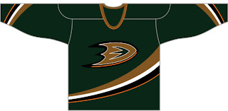
The Anaheim Ducks concept suggests workinng green back into the color scheme. I think that would be a wise move, but maybe something a little brighter would be in order. I do like the "D" logo on the chest as well. Definitely an improvement.
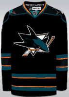
Another designer has also suggested that the Sharks try out black sweaters — be it on a full-time or part-time basis. This isn't half bad. The orange works very nice in this concept. Pretty sharp.
Here's a new design created for the Dallas Stars.
It's so weird looking. You really have to stare at it a minute. The stripes around the bottom are odd. Looks like they're going to eat me. Anyway, we'll finish things off in Tennessee with the Nashville Predators.
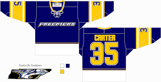
Also weird, but not quite enough to freak me out. I sort of hope that thing in the bottom left corner isn't meant to be a logo of any sort. That would freak me out. Anyway, not a terrible jersey, but also not one I'd be a fan of.
If you've got thoughts on any of these, feel free to leave them below.


