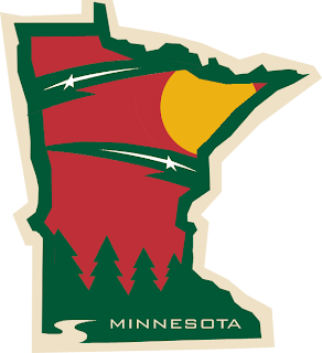
What A Wild Work Of Art!
You know, surprisingly, it has been a lot of work getting the new site up and running in the last few days. If you haven't seen it yet, check out the Tournament of Hockey Logos blog, the spinoff to NHLToL. If you're a minor league hockey fan, head over there and vote for which league will get the first tournament — AHL or ECHL.
Now onto today's news — or something like that. Two months ago I posted a really cool secondary logo someone designed for the Minnesota Wild using the outline of the state itself. Well another one was sent to me and I think it's even better!
I can't get over how many talented people read and contribute to this blog. It's really a great thing. That logo matches so well with the primary while at the same time maintaining its own identity. That is very impressive work and I'd like to be the first to say so.
On a separate yet Wild-related note, several fans have suggested the team return to green home jerseys and keep the red for an alternate sweater. So here's what the current home jersey would look like in green.
It certainly is unique and not all that bad, if you ask me. Yet for some reason this one conjures up Christmas for me — unlike the red one. So I'm posing the question to you all. What do you think?
Beyond that, what do you think of that logo? Impressive work isn't it? I look forward to reading your comments as always.

