Just To Freak You Out X
It's like watching a trainwreck. It's horrible, but there's just something about it that prevents you from looking away. There's all manner of scary stuff out there and now I'm bringing some of it straight to you on another Freak Out Friday. Here goes.
I wouldn't be able to live with myself if I didn't start with this one.
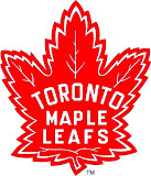
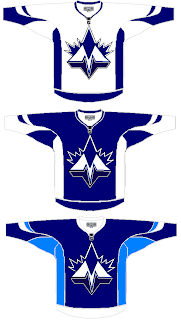 It shouldn't take you more than a second to realize the designer was trying to offer us something different for the Toronto Maple Leafs.
Leafs fans, I really want to hear from you on this one.
We've got a brand new logo with a very prominent "M" worthy of perhaps a place like Minnesota — or Montreal! And that leaf! Don't look it in the eye or it will cut you. Deep.
Even the second shade of blue worries me some. I'm not sure how I'm supposed to feel about this, but let's just say it's not great.
Anyway, I'd like to move along now because I can't take looking at this anymore. There's a point when doing this to a team like the Leafs starts to hurt.
Once again, Leafs fans, please comment.
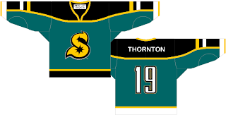
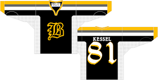
Speaking of prominent letters in place of actual logos, I've got a pair of concepts from each coast.
Cleverly, though, we can't know exactly what these letters stand for as alliteration was employed to mask it. Is the "S" for San Jose or Sharks? And is the "B" for Boston or Bruins? Perhaps, the ultimate question is why dump perfectly good logos for these two teams in favor of members of the alphabet?
Even more disturbing is that "S" keeps reminding me of the Minnesota North Stars. Make it stop.
Each of those were delivered to me with a road sweater design to match. I wouldn't do that to you, though.
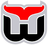
Here's what concerns me, though. I've been send a number of logos which have been converted to red and black for no apparent reason. Do any of these work?
It may be that the blood-in-the-water shark is the scariest one. I do see what's going on, though with the Hurricanes colors on the Whalers logo and the old Sabres colors on the new logo — but that doesn't make it any better.
I'm still worried about the killing to follow.
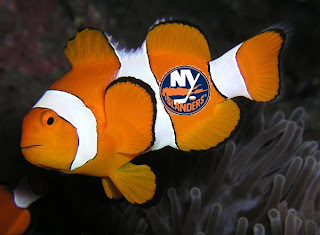
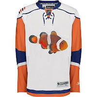
I'll wrap things up today with the thing that might frighten you the most. Did you ever get to feeling like that Rbk EDGE New York Islanders jersey reminded you of something? Perhaps you couldn't quite put your finger on it. But maybe it evoked feelings of being lost. In the ocean.
One reader thought so and sent in this.
If you wanted to know what they were thinking when designing the new Isles uniforms, now you do. Don't you wish you didn't?
So there it is. Another in the Freak Out series is behind us. I'm looking forward to next week. In the meantime, I await your crazy concept art. You can send it to me at nhllogos@gmail.com.
